
- Basic Functions
- Mouse Actions
- Supported File Formats
- Use Cases
- Frequently Asked Questions (FAQ)
- Troubleshooting
<< To Map page
1. Basics Functions ^


When the "Photos" tab is clicked, a tab will appear where folder three is shown with different features and tools.
The tab contains one subtab, "Folder tree".
Folder Tree Subtab ^
Folder Tools ^

Folders can be activated by checking the box next to the folder name.
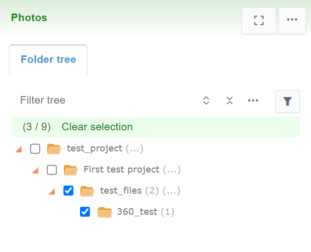
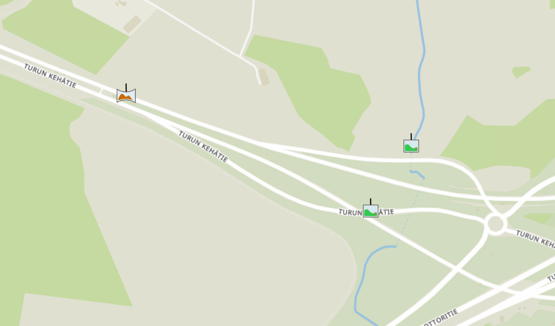
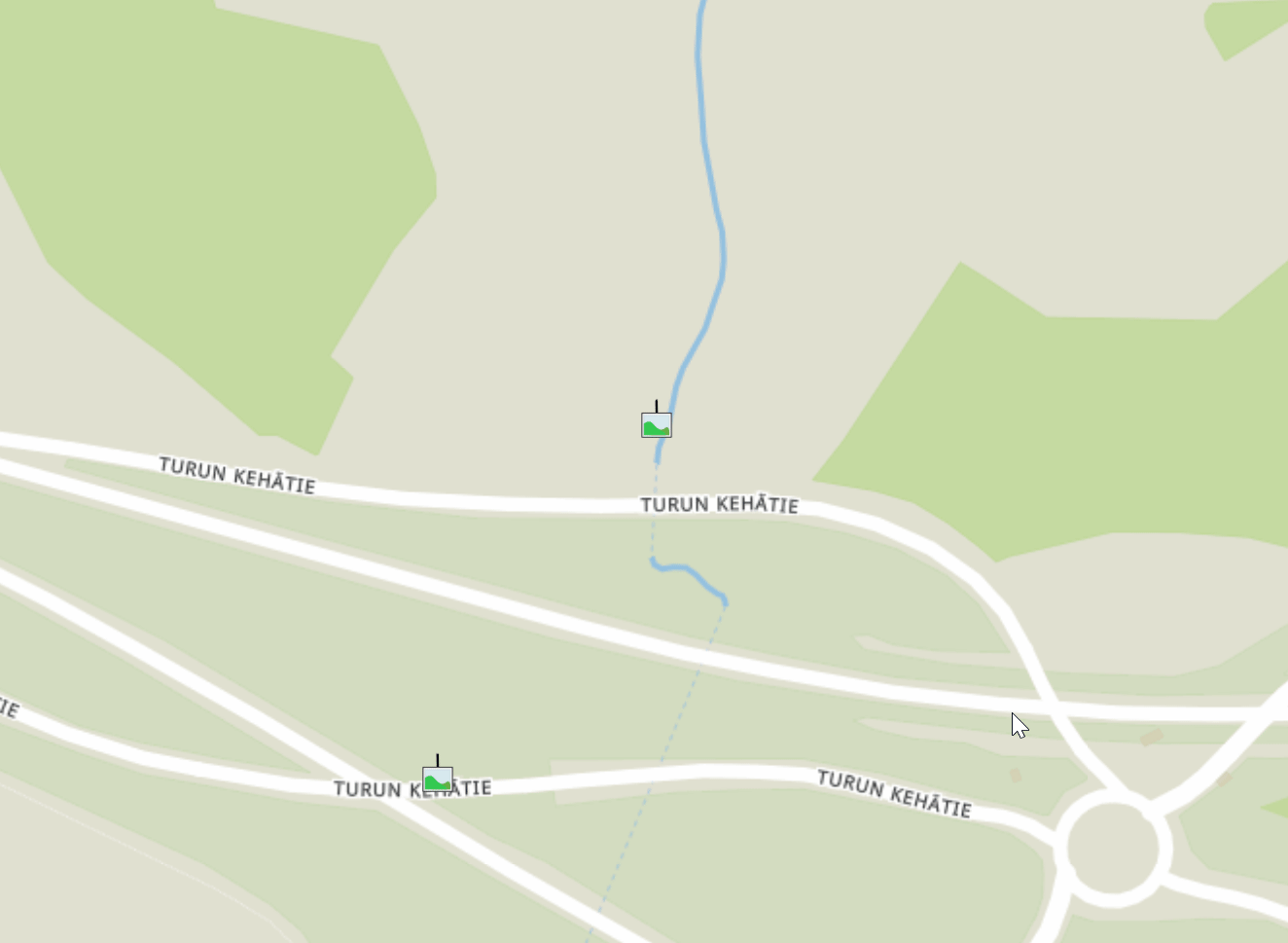
By checking a box next to a folder name, all the image files in the folder that have location information will be visible on the map.
By clicking "Select all", the user can activate all the folders in the project.
When folders are activated, the "Clear Selection" tool becomes available.
By clicking "Clear selection", the user can deactivate all the activated folders.
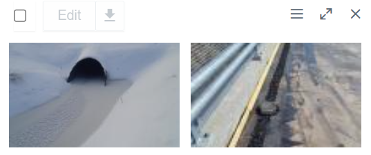
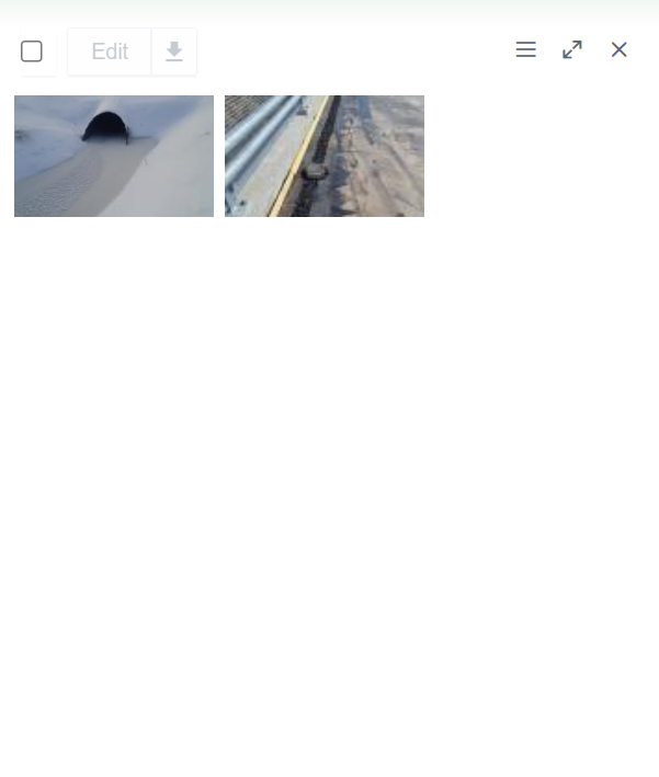
Folder content can be viewed in the tab by clicking the folder name.

By clicking the folder name, the user can view all the image files in the folder as a list at the bottom of the tab.

Folder Tree Tools ^
Above the folder tree, different tools can be found to browse the folders.
In the "Filter tree" bar, the user can search folders from the folder tree.
By clicking the "Expand tree" button, the whole folder tree will be revealed.
By clicking the "Tree settings" button, a box will appear.
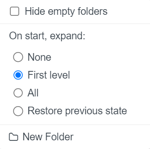
By adding a check mark to "Hide empty folders" all the empty folders in the folder tree will be hidden.
"On start, expand", the user can determine how the folder tree is shown after the browser page has been reloaded, for example, when the user logs in to Infrakit or refreshes the page. "None" means that only the root folder is shown; "First level" means that only the direct subfolders of the root folder will be shown; "All" means that all the folders in the folder tree will be shown; and "Restore previous state" means that the previous state of the folder tree will be restored.
By clicking "New Folder", the user can create a new folder under the folder that has been chosen.
Filter Tools ^
After a folder or several folders have been selected, the user can filter the files using filter tools.

By checking or unchecking "Show images on map", the user can determine whether the photo icons are visible on the map.
By inserting values in the "From" and "To" bars, the user can filter a timespan for the photos. All the photos that have been uploaded during this period will be visible. The user can also select predetermined time periods such as "Today", "This week", "Last week", "Last 14 days", "1 month", "3 months", "6 months", or "1 year" above the "From" and "To" bars.
By inserting a value in the "Name / Description" bar, the user can filter photos based on the name or the added description.
From the "Type" drop-down bar, the user can filter photos based on whether the photo has a location value or not or if the photo is panorama.
From the "User" drop-down bar, the user can filter photos that have been uploaded by a specific user.
From the "Alignment" drop-down bar, the user can filter photos that have been attached to a specific alignment.
File Tools ^
The user can select an individual file or several files at once.

All the files can be selected by checking the box at the top.

By checking the box next to a file name or checking all files at the top, new features become available.
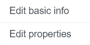
By clicking "Edit basic info", a side window will open.
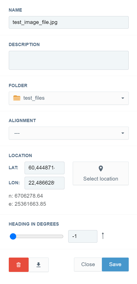
In this window, the user can modify several image file attributes.
In the "DESCRIPTION" box, the user can provide a description for the image file.
From the "FOLDER" drop-down bar, the user can change the folder where the image file is located.
From the "ALIGNMENT" drop-down bar, the user can attach the image file to an alignment.
In the "LOCATION" section, the user can modify the location of the file on the map. In the "LAT" and "LON" bars, the user can insert latitude and longitude values. By clicking the "Select location" button, the user can select the location from the map.
In the "HEADING IN DEGREES" section, the user can define the direction of the photo by sliding the knob or inserting a value in the bar.
By clicking the "Save" button, the user can save the modifications, and by clicking the "Close" button, the user can close the window without any modifications.
By clicking "Edit properties", a box will open.
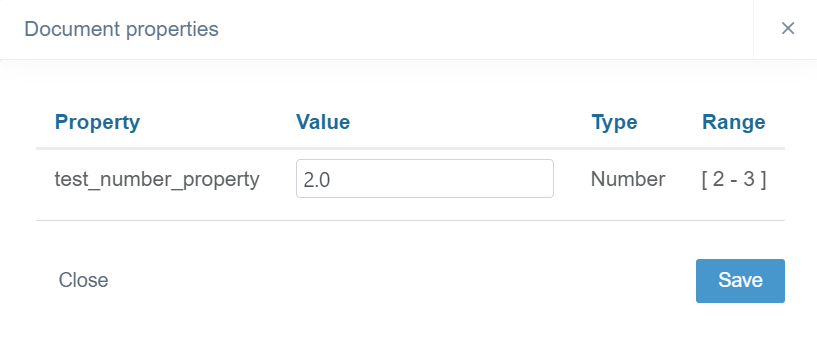
In the "Value" bar or drop-down box, the user can insert a new value for the property.
By clicking the "Save" button, the user can save the modifications, and by clicking the "Close" button, the user can close the box without any modifications.
By hovering the cursor over the image file's name, three dots appear at the end of the file's row.

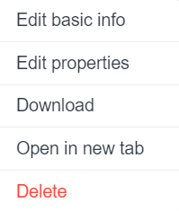
In this box, the same tools are provided as in previous sections, along with some extra features.
By clicking "Edit basic info" or "Edit properties", the user can navigate to "Edit basic info", "Edit properties"
By clicking "Download", the user can download the image file to local storage.
By clicking "Open in new tab", the user can open a preview of the image file in a new browser tab.
By clicking "Delete", the user can delete the image file.
General Tools ^
Fit Visible ^
By clicking the dashed-line square, the user can fit all the selected photos in the map view.
Additional Tools ^
By clicking the three-dot icon button, a list of tools will appear.

Bulk Edit ^
By clicking "Bulk edit", a side window will open.
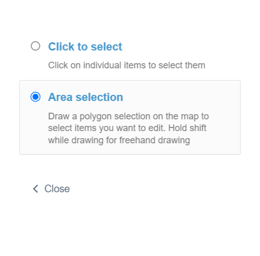

By choosing "Click to select", the user can individually select multiple photos from the map.

With "Area selection", the user can draw an area on the map by clicking several arbitrary points. By double-clicking the left mouse button, the area will be closed, and the photos covered will be chosen.
After the photos have been selected, a new side window will open.
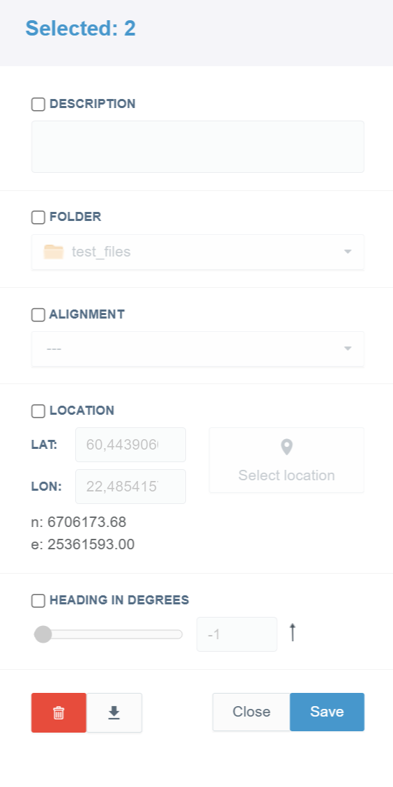
In this window, the user can modify the same image attributes as when "Edit basic info" is clicked, but for several image files.
From the "Selected" section, the user can observe how many image files have been selected.
By checking the box next to the attribute, the user can alter the "DESCRIPTION", "FOLDER", "ALIGNMENT", "LOCATION", and "HEADING IN DEGREES" of the image files.
By clicking the "Save" button, the user can save the modifications, and by clicking the "Close" button, the user can close the window without any modifications.
Upload ^
By clicking "Upload", a new box will open.

By dragging and dropping, the user can select image files to upload.
By clicking "browse files" or "My Device", the user can browse local folders to select image files to upload.
By clicking "Camera", the user can use the web camera to upload image or video files.
From the "PHOTO NAME TEMPLATE" drop-down bar, the user can choose if a name template or the original file name will be used when uploading. Name templates can be created in the Project Settings page, section "Name templates".
In the "DESCRIPTION" bar, the user can provide an optional description for image files.
From the "FOLDER" drop-down bar, the user can select the folder where the image files will be uploaded.
By clicking the "Edit properties" button, a new box will open.
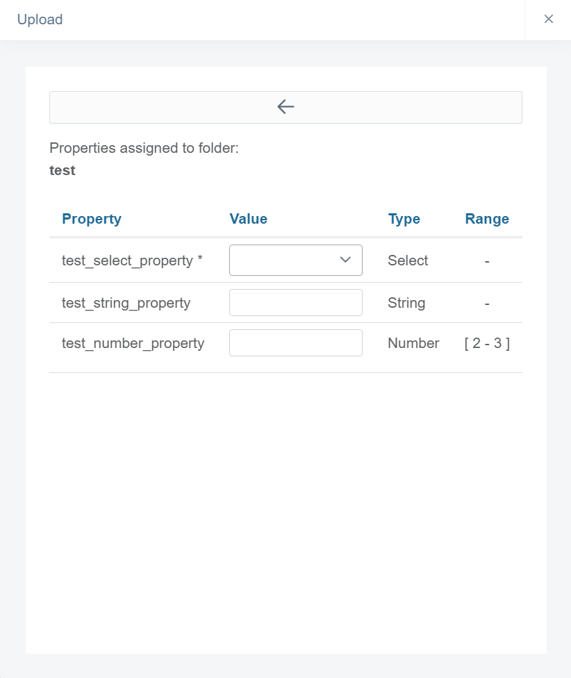
In the "Property" column, all the properties that are assigned to the folder will be listed. In the "Value" column, the user can select or insert property values. From the "Type" column, the user can observe the type of the property. From the "Range" column, the user can observe if a certain range is determined for the property value.
By clicking the arrow icon, the box will be closed, and the modifications will be saved.
Folder properties can be created in the Project Settings page, section "Properties".
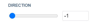
In the "DIRECTION" section, the user can define the direction of the photo by sliding the knob or inserting a value in the bar.
The user must click the "Upload" button at the end to start uploading the image files.
Download ^
In the "DOWNLOAD" section, different download options are provided.
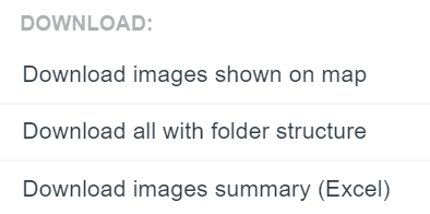
By clicking "Download images shown on map", the user can download the photos currently on the map view.
By clicking "Download all with folder structure", the user can download the whole folder structure presented in the "Photos" tab with image files included.
By clicking "Download images summary (Excel)", the user can download an Excel file that represents the whole folder structure of the project. The file has been filtered to show only photo files.
Icon Size ^
In the "ICON SIZE" section, the user can determine the size of the icons on the map.
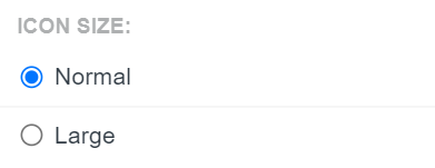
By checking "Normal" or "Large", the user can select whether the icon's size on the map is normal or large.
Sort ^
In the "SORT" section, the user can define how the image files will be sorted.

By checking "Date" or "Station", the user can select whether the image files will be sorted by the date or station in the folder tree.
2. Mouse Actions ^

By clicking an image file with the right button on the mouse, the same features and tools become available as when the three dots are clicked at the end of the file's row.

By clicking an individual image file icon on the map with the left button on the mouse, a box will open.

By clicking the arrow icon buttons, the user can browse the image files in the selected folders.
By clicking the pen icon at the top, the same box will open as when "Edit basic info" is clicked.
By clicking "Locate on map", the user can adjust the map based on the selected image file.
By clicking "Download", the user can download the image file to local storage.
By clicking "Open full image in new window", the user can open a preview of the image file in a new browser tab.
By clicking the pen icon next to "Properties", the same box will open as when "Edit properties" is clicked.
By clicking an individual image file icon on the map with the right button on the mouse, four additional options will appear.
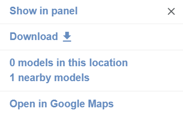
By clicking "Show in panel", the user can make the image file active in the file view at the bottom of the tab.
By clicking "Download", the user can download the image file to local storage.
Options "models in this location/nearby models" and "Open in Google Maps" are explained in the article "Map Page", section "Mouse Actions".

By clicking a folder in the folder tree with the right button on the mouse, one option appears.
By clicking "New Folder", a box will open.

In this box, the user can create a new subfolder inside the selected folder.
In the "NAME" bar, the user must insert a name for the folder.
In the "DESCRIPTION" box, the user can provide additional information about the folder.
From the "PARENT FOLDER" drop-down bar, the user can change the parent folder for the new folder.
The user must click the "Create" button at the end to complete the creation. If the user wants to close the box without creating a folder, the "Close" button can be clicked.
3. Supported File Formats ^
JPG, PNG, HEIC
 Can't find what you're looking for?