Linked pages:
By clicking the name, you will be directed to a new page.
1. Basic Functions
1. Pages
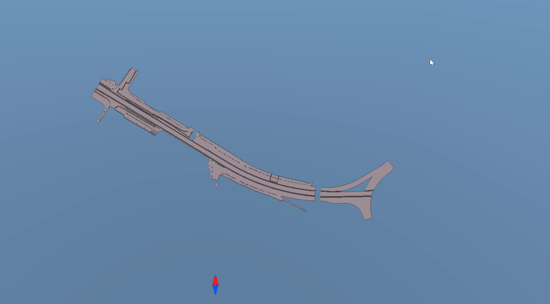
The ribbon at the top indicates all the pages that are included in the Infrakit software. Map is the default starting page when you log in to Infrakit software.
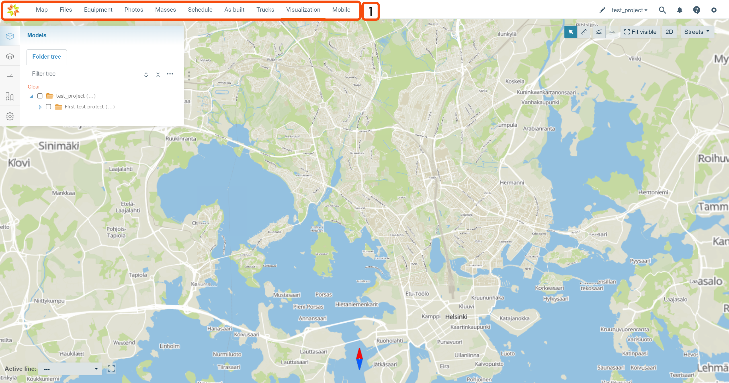
By clicking the page icon below, you can find more information about each page.


By clicking the Infrakit logo on the left-top corner of the page, the user will be directed to the Infrakit starting page.

2. Tabs
The tabs on the left side of the page indicate different modules that can be used on the visualization page.
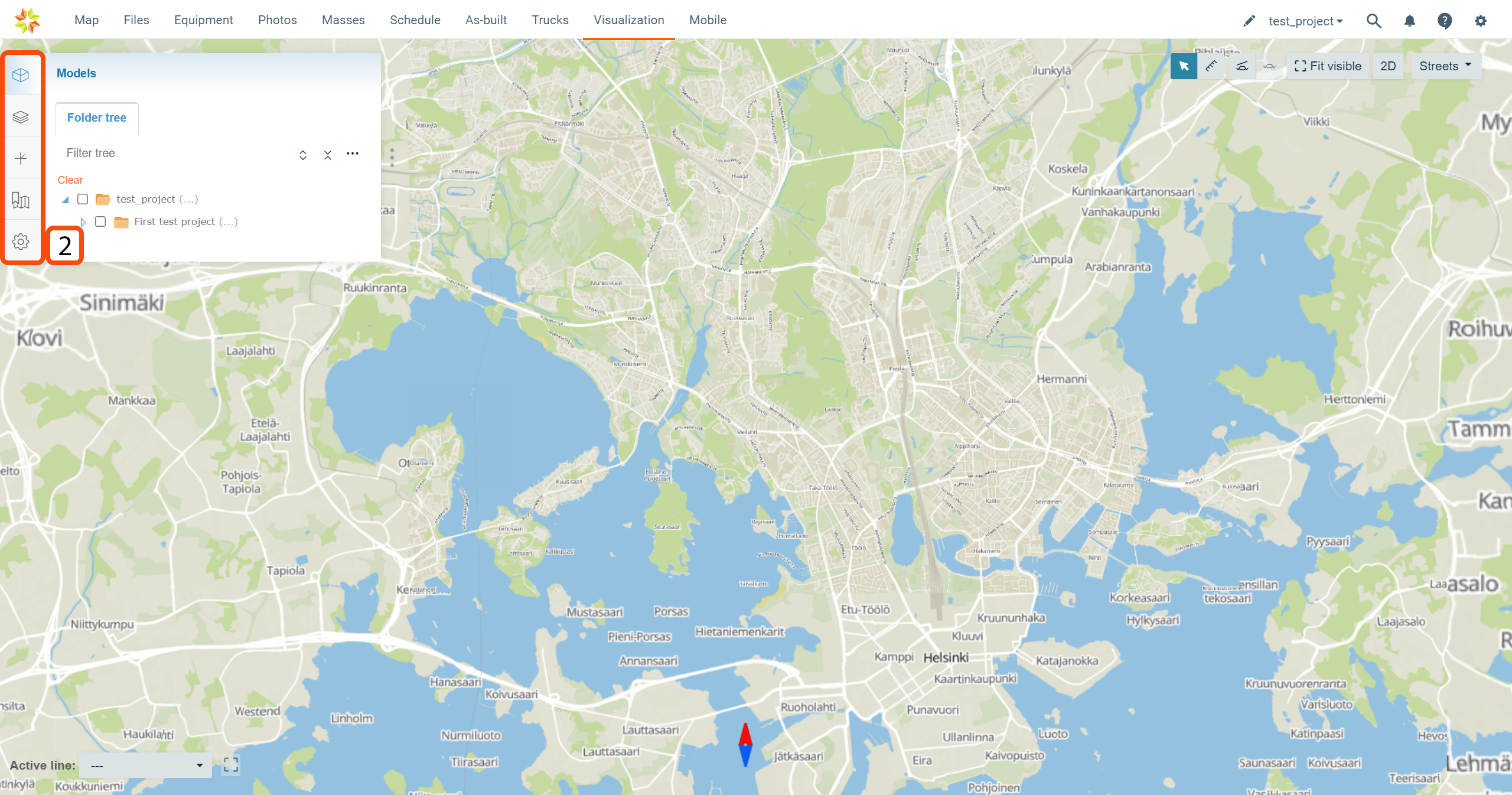
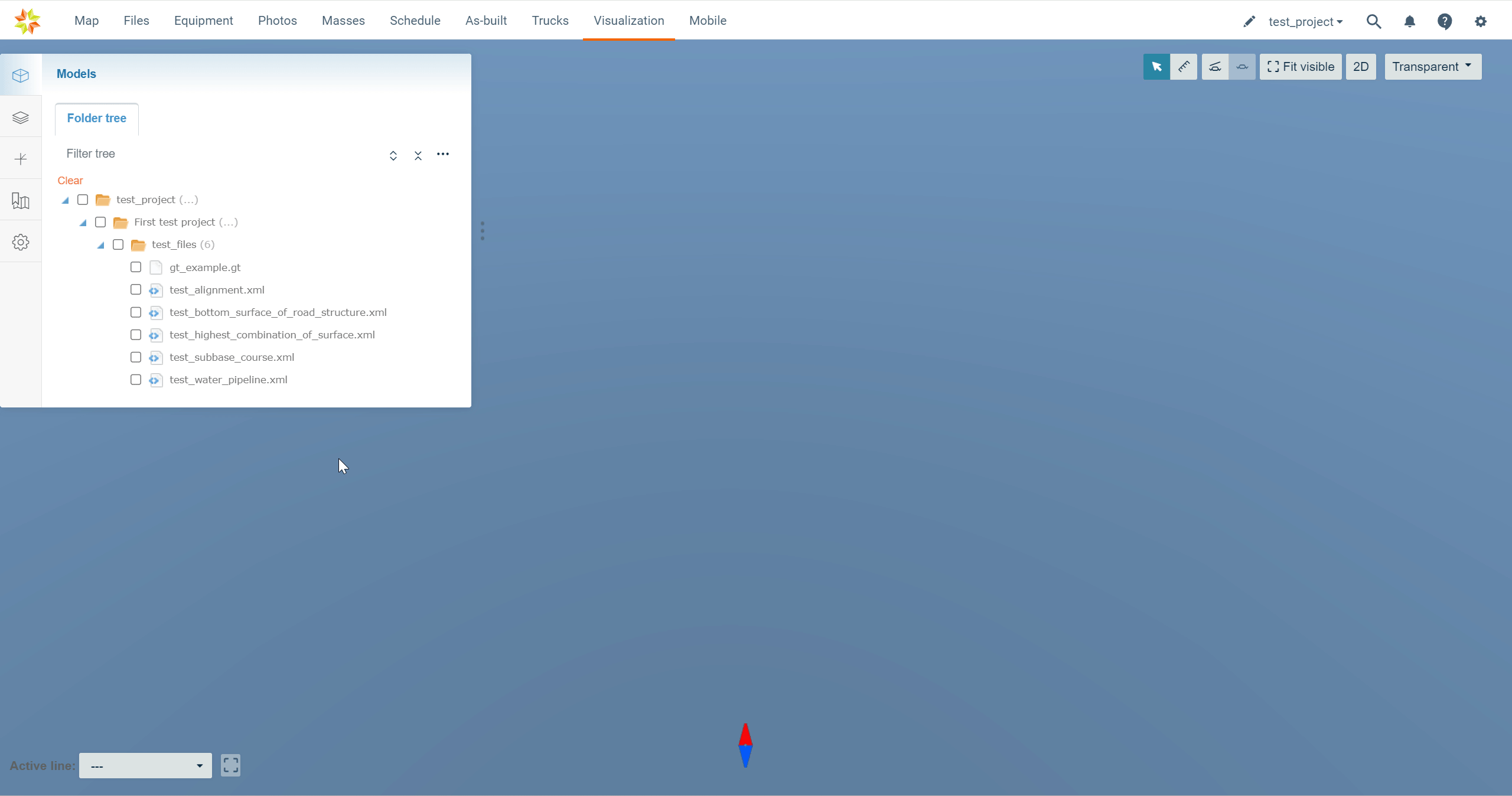
Models Tab
By clicking the "Models" tab icon, the tab will open.

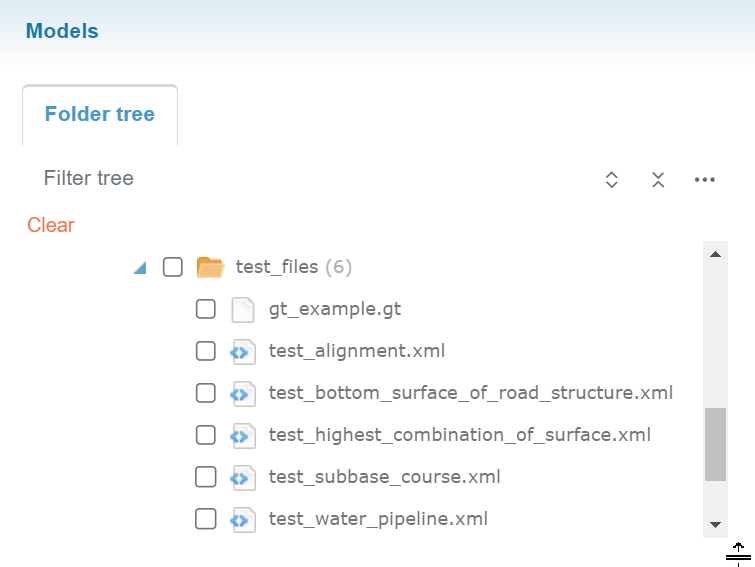
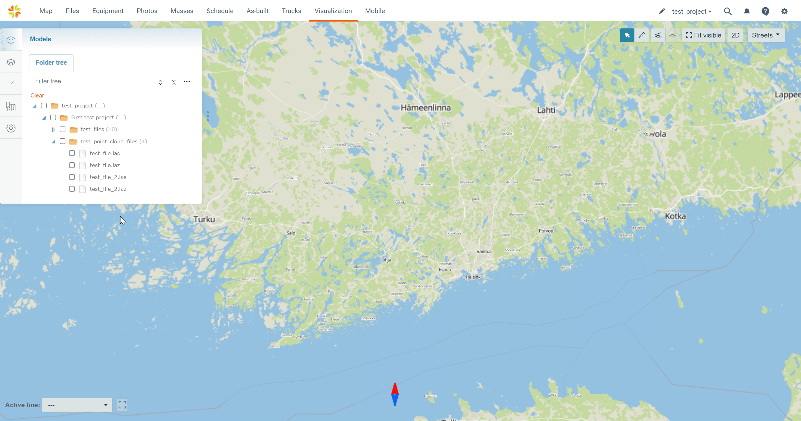
The tab contains one subtab, "Folder tree".
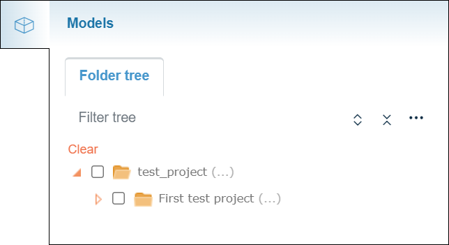
Folder Tree Subtab
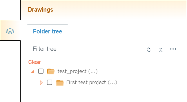
The "Folder tree" subtab contains the folder tree with different tools to browse the folders.

In the "Filter tree" bar, the user can search folders or files from the folder tree.

By clicking the "Expand tree" button, the whole folder tree will be revealed.
By clicking the "Collapse tree" button, the folder tree will be collapsed so that only the root folder will be visible.


By clicking the "Tree settings" button, a box will appear.

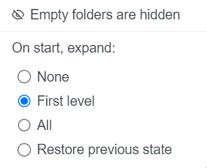
As a default, empty folders in the folder tree are hidden, and this cannot be changed.
"On start, expand", the user can determine how the folder tree is shown after the browser page has been reloaded, for example, when the user logs in to Infrakit or refreshes the page. "None" means that only the root folder is shown; "First level" means that only the direct subfolders of the root folder will be shown; "All" means that all the folders in the folder tree will be shown; and "Restore previous state" means that the previous state of the folder tree will be restored.
Activating Models
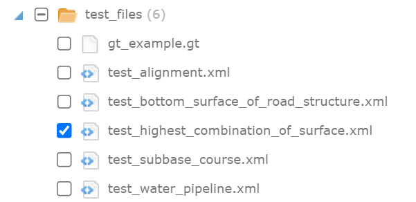
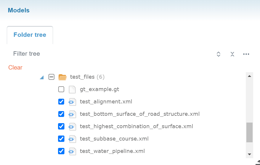
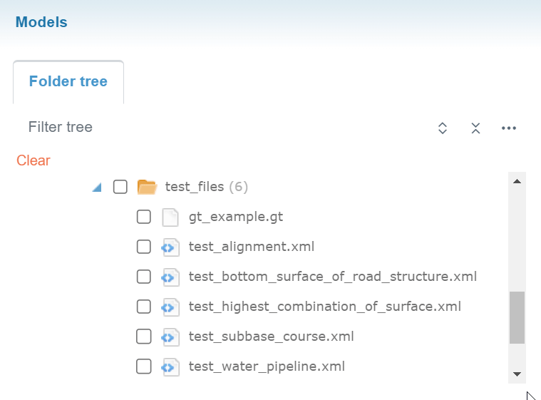
Models can be selected and unselected by checking and unchecking the boxes next to the file name.
By clicking the file name, the user can readjust the map according to the model.
By checking a folder, the user can select all the files inside a specific folder.
By clicking "Clear", all the selected models can be unselected.
Mouse Actions
Folders
When a folder name is clicked in the folder tree with the right button on the mouse, an option appears.
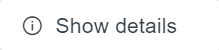
By clicking "Show details", a box will open.
In this box, the user can observe the basic properties of the folder.
Files
When a file name is clicked in the folder tree with the right button on the mouse, three options appear.
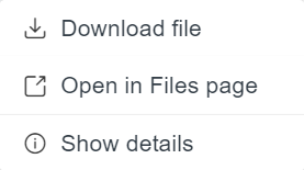
By clicking "Download", the user can download the model's file to local storage.
By clicking "Open in Files page", the user will be directed to the "Files" page in the folder where the file is located, and the file will be marked as selected.
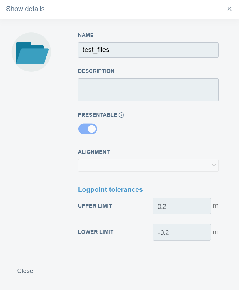
By clicking "Show details", a bow will open.
This box contains three tabs: "File Info", "Versions", and "Comments".
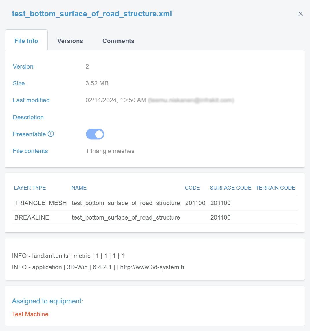
In the "general.file_info" tab, the user can observe the file's basic properties.
By clicking "Versions", a new view appears.
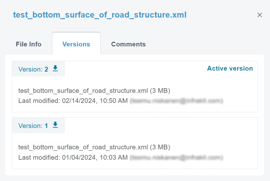
In this tab, the user can observe the version history and the current active version of the file.
By clicking the downward arrow next to the version number, the user can download the version.

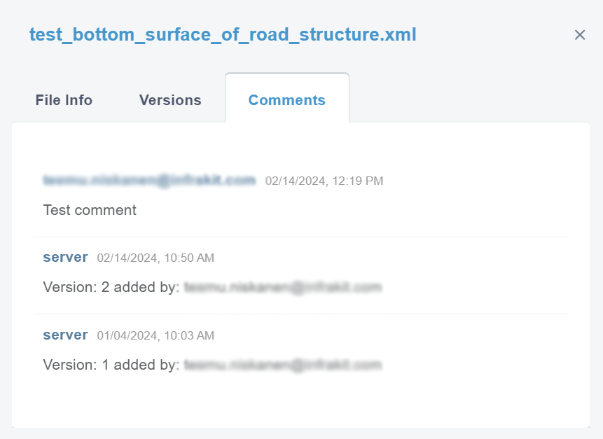
By clicking "Comments", a new view appears.
In this tab, the user can observe the comments left on a specific file and the file's version activity.
Models
When a model is clicked with the left button on the mouse, a box will appear.
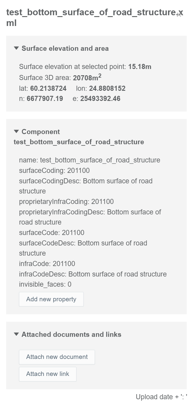
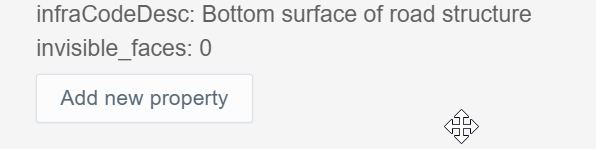
In this box, the user can observe information about the model, add new properties, and attach documents and links to the model.
By clicking "Add new property", two bars appear.
In the "Name" bar, the user can insert the name for the property.

In the "Value" bar, the user can insert the value for the property.

By clicking the save icon, the user can save the new property.
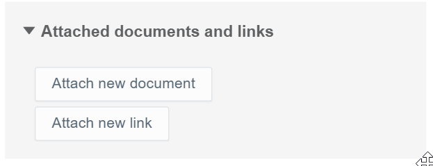
By clicking "Attach new document", two bars appear.
In the "Name" bar, the user can insert the name of the document that will be attached.

From the drop-down bar, the user can select the document that will be attached.

By clicking the save icon, the user can complete the attachment.
By clicking "Attach new link", two bars appear.

In the "Name" bar, the user can insert the name for the link that will be attached.
In the "URL" bar, the user can insert the URL of the web page.

By clicking the save icon, the user can complete the attachment.
When a model is clicked with the right button on the mouse, a box will appear.
In this box, the user can adjust how the model is visualized.
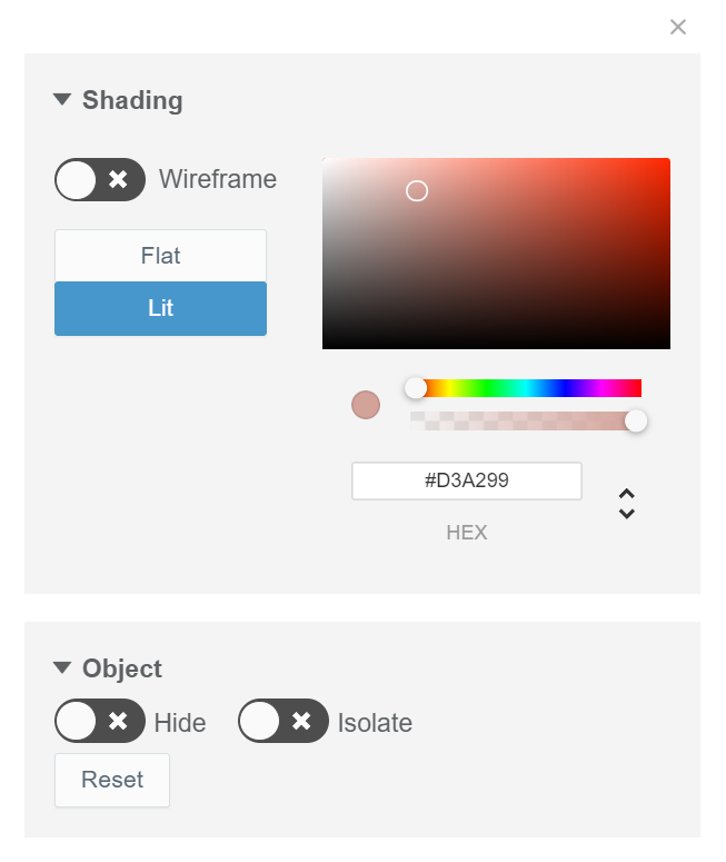
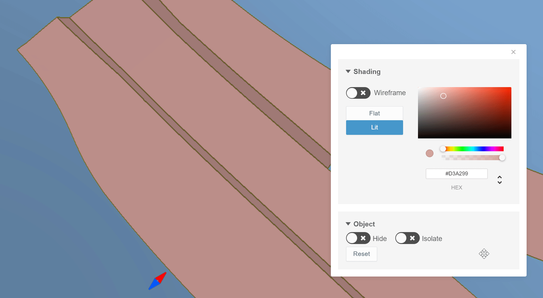
By sliding the knob in the section "Wireframe", the user can turn on the triangle mesh.
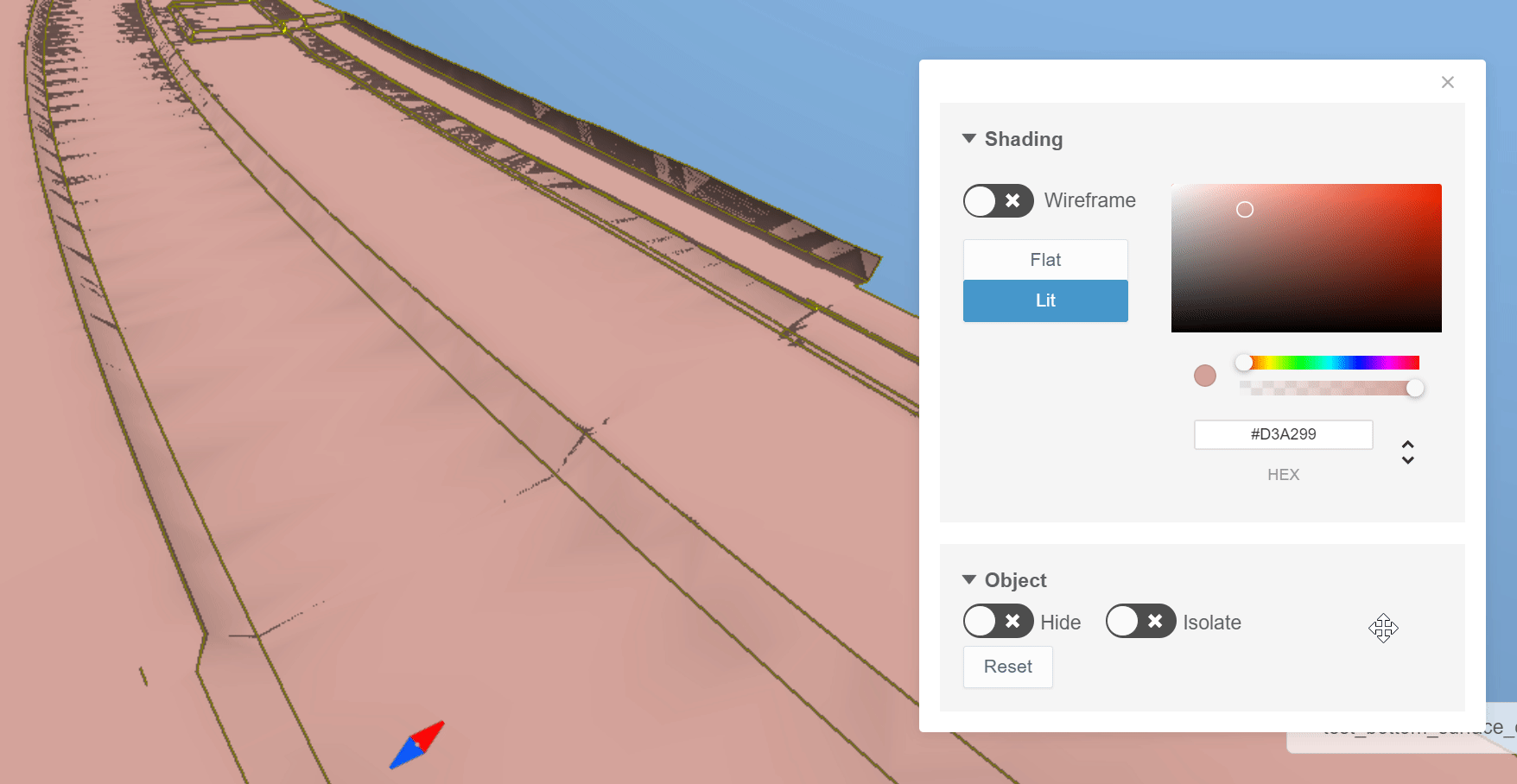
By switching between "Flat" and "Lit", the user can define how the shadows are visualized.
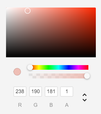
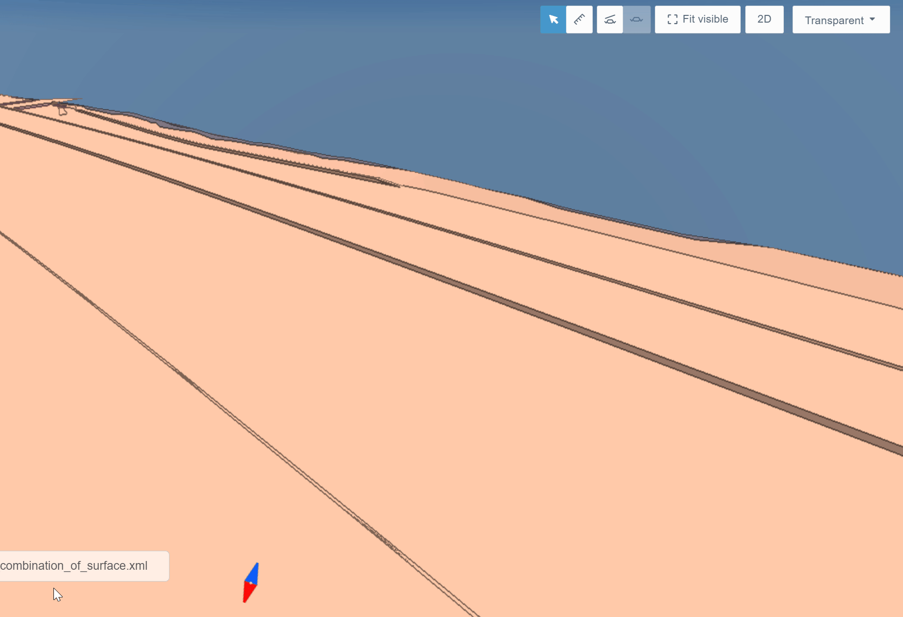
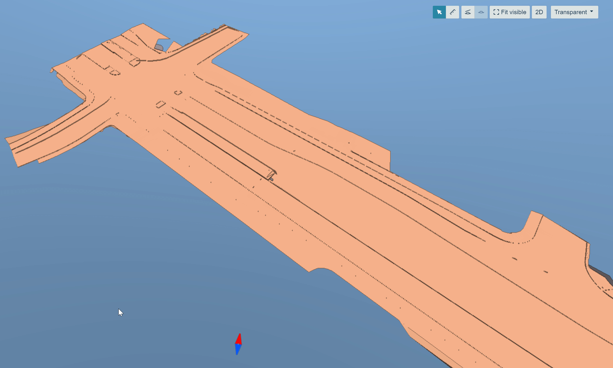
From the color palette, the user can alter the color and the transparency of the model.
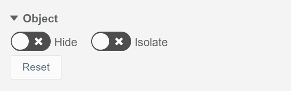
In the "Object" section, the user can hide or isolate a specific object by sliding the knob in the sections "Hide" and "Isolate".
By clicking the "Reset" button, the models will be returned to their original state.
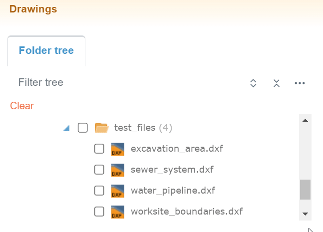
Drawings Tab
By clicking the "Drawings" tab icon, the tab will open.

The tab contains one subtab, "Folder tree".
Folder Tree Subtab
The "Folder tree" subtab contains the folder tree with different tools to browse the folders.

In the "Filter tree" bar, the user can search folders or files from the folder tree.

By clicking the "Expand tree" button, the whole folder tree will be revealed.
By clicking the "Collapse tree" button, the folder tree will be collapsed so that only the root folder will be visible.


By clicking the "Tree settings" button, a box will appear.
As a default, empty folders in the folder tree are hidden, and this cannot be changed.
"On start, expand", the user can determine how the folder tree is shown after the browser page has been reloaded, for example, when the user logs in to Infrakit or refreshes the page. "None" means that only the root folder is shown; "First level" means that only the direct subfolders of the root folder will be shown; "All" means that all the folders in the folder tree will be shown; and "Restore previous state" means that the previous state of the folder tree will be restored.
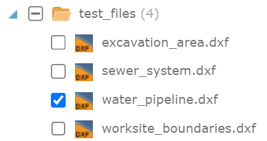
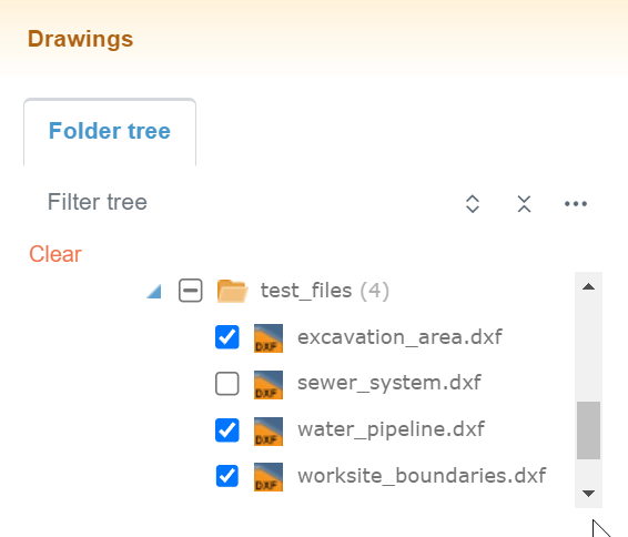
Activating Drawings
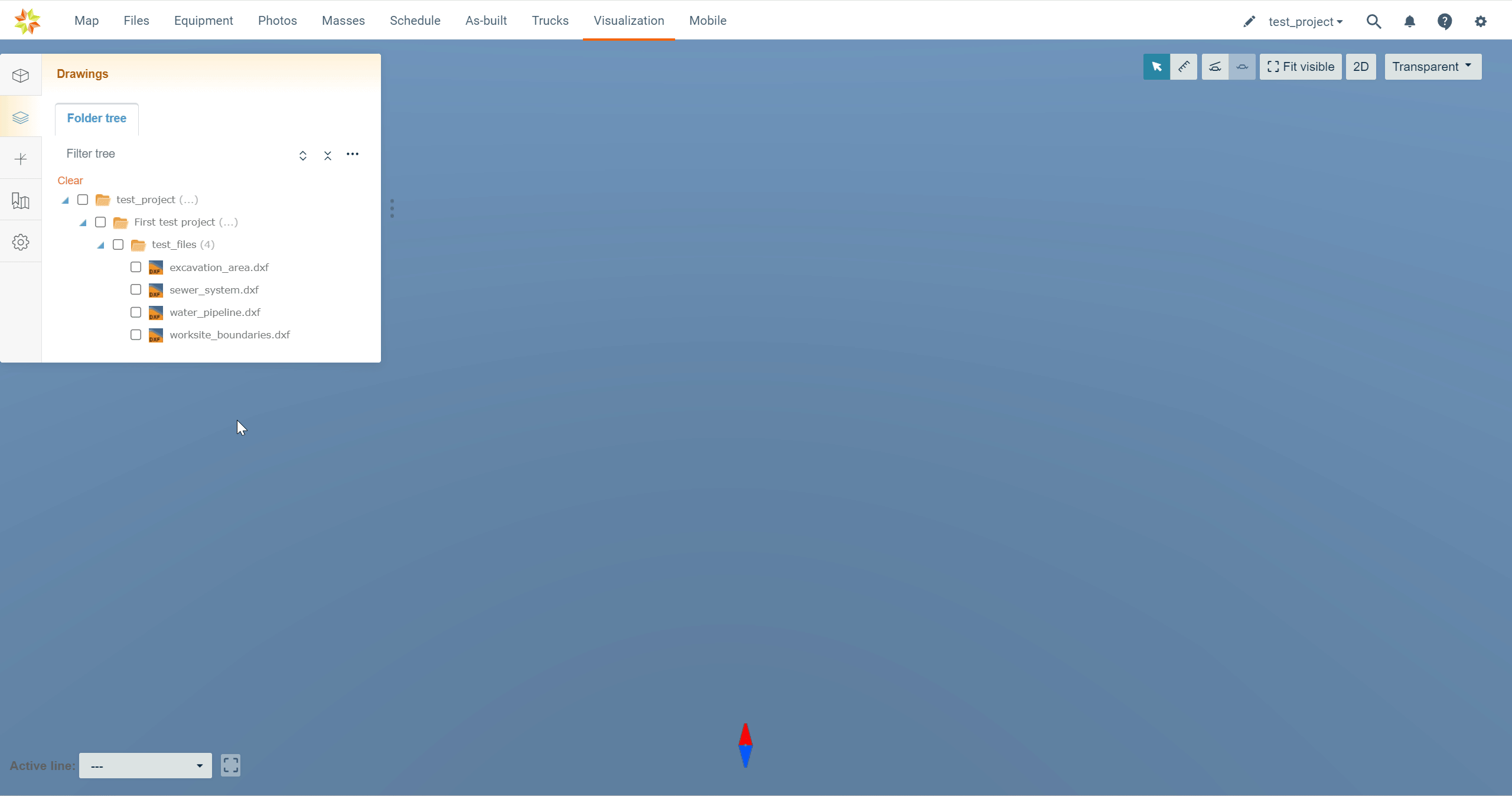
Drawings can be selected and unselected by checking and unchecking the boxes next to the file name.
By clicking the file name, the user can readjust the map according to the drawing.
By clicking "Clear", all the selected models can be unselected.
Mouse Actions
Folders
When a folder name is clicked in the folder tree with the right button on the mouse, an option appears.

By clicking "Show details", a box will open.
In this box, the user can observe the basic properties of the folder.

Files
When a file name is clicked in the folder tree with the right button on the mouse, three options appear.

By clicking "Download", the user can download the drawing's file to local storage.
By clicking "Open in Files page", the user will be directed to the "Files" page in the folder where the file is located, and the file will be marked as selected.
By clicking "Show details", the same box will open as in the "Models" tab.
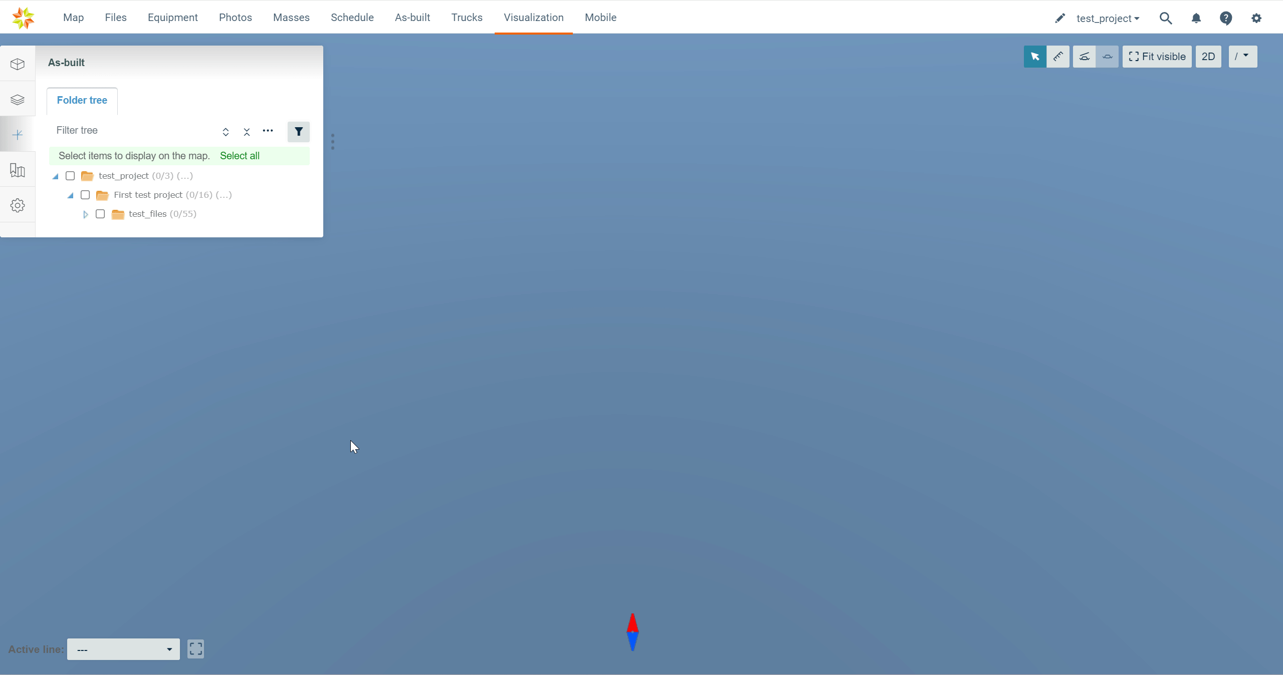
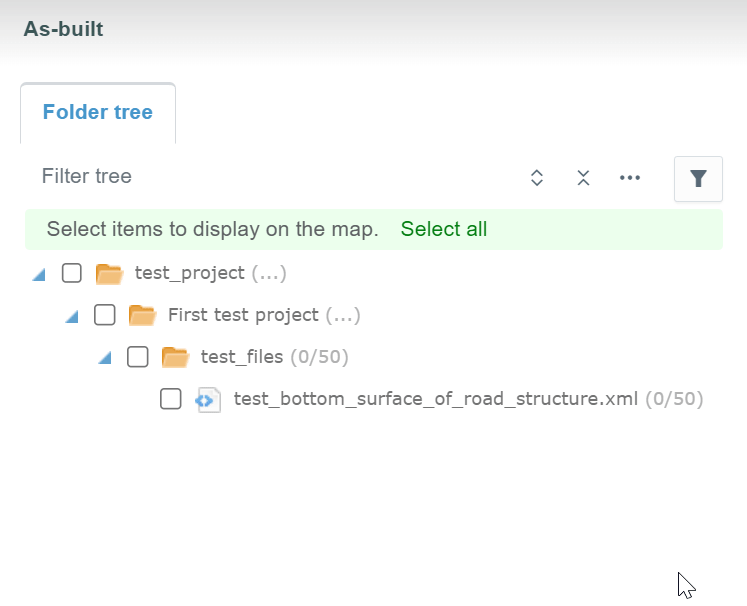
As-Built Tab
By clicking the "As-built" tab icon, the tab will open.

The tab contains one subtab, "Folder tree".
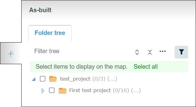
Folder Tree Subtab
The "Folder tree" subtab contains the folder tree with different tools to browse and filter the folders.
Filter tools

By clicking the "Filters" button, a box appears.
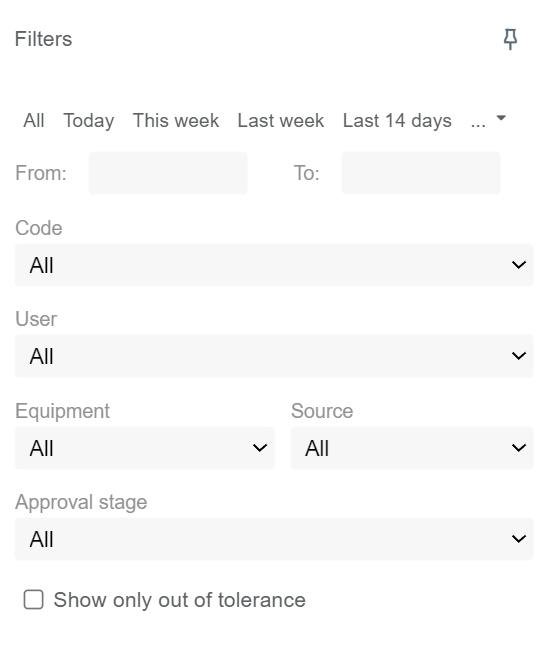
By inserting values in the "From" and "To" bars, the user can filter a timespan for the log points. All the log points that have been uploaded during this period will be visible. The user can also select predetermined time periods such as "Today", "This week", "Last week", "Last 14 days", "1 month", "3 months", "6 months", or "1 year" above the "From" and "To" bars.
From the "Code" drop-down bar, the user can filter log points based on the point code.
From the "User" drop-down bar, the user can filter log points based on a specific user.
From the "Equipment" drop-down bar, the user can filter log points based on specific equipment.
From the "Source" drop-down bar, the user can filter log points based on the source of the point.
From the "Approval stage" drop-down bar, the user can filter log points based on the approval state of the points.
By checking the "Show only out of tolerance" box, the user can hide the log points that adhere to the tolerance requirements.
By clicking the pin icon, the user can pin the box next to the tab.

Folder Tree Tools

In the "Filter tree" bar, the user can search folders or files from the folder tree.

By clicking the "Expand tree" button, the whole folder tree will be revealed.
By clicking the "Collapse tree" button, the folder tree will be collapsed so that only the root folder will be visible.


By clicking the "Tree settings" button, a box will appear.

By adding a check mark to "Hide empty folders" all the empty folders in the folder tree will be hidden.
"On start, expand", the user can determine how the folder tree is shown after the browser page has been reloaded, for example, when the user logs in to Infrakit or refreshes the page. "None" means that only the root folder is shown; "First level" means that only the direct subfolders of the root folder will be shown; "All" means that all the folders in the folder tree will be shown; and "Restore previous state" means that the previous state of the folder tree will be restored.
By clicking "New Folder", the user can create a new folder under the folder that has been chosen.
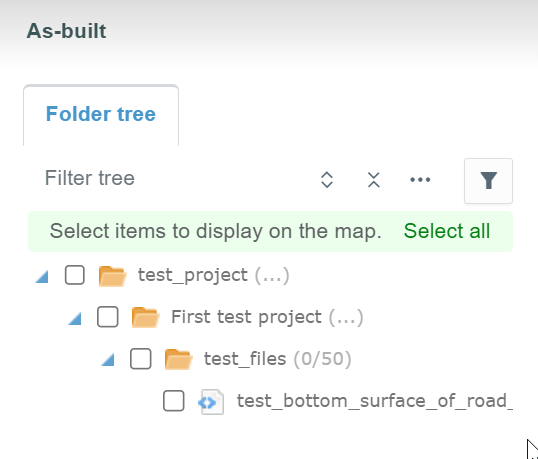
Activating Log Points
Log points can be selected and unselected by checking and unchecking the boxes next to the file or folder name.
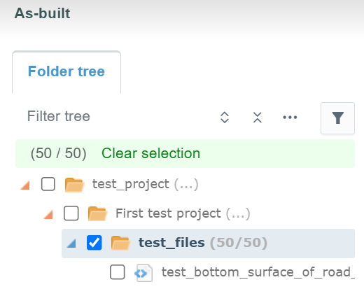
By clicking the file or the folder name, the user can readjust the map according to the log points.
By clicking "Clear selection", all the selected log points can be unselected.
By clicking "Select all", the user can select all the log points in the project.
Mouse Actions
Folders
When a folder name is clicked in the folder tree with the right button on the mouse, two options appear.
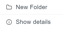
By clicking "New Folder", the user can create a new folder under the folder that has been chosen.
By clicking "Show details", a box will open.
In this box, the user can observe the basic properties of the folder.

Files
When a file name is clicked in the folder tree with the right button on the mouse, three options appear.

By clicking "Download", the user can download the file where the log points are attached to local storage.
By clicking "Open in Files page", the user will be directed to the "Files" page in the folder where the file is located, and the file will be marked as selected.
By clicking "Show details", the same box will open as in the "Models" tab.
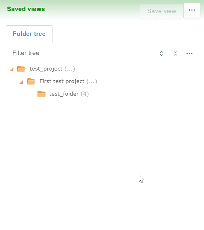
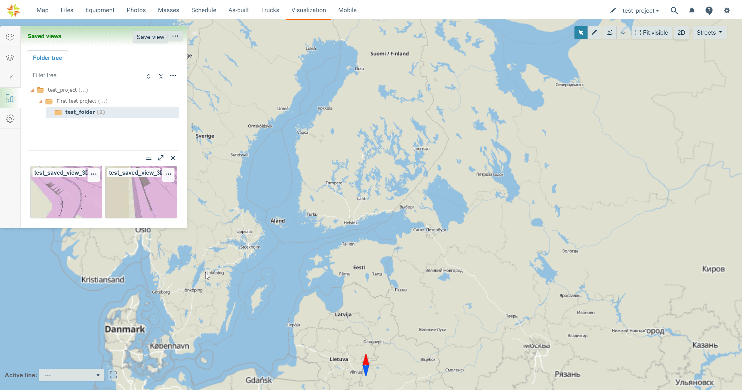
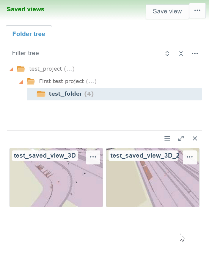
Saved Views Tab
By clicking the "Saved views" tab icon, the tab will open.

The tab contains one subtab, "Folder tree".
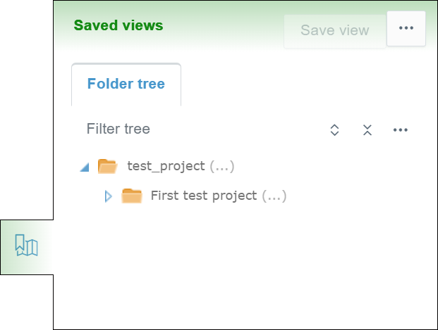
Folder Tree Subtab
The "Folder tree" subtab contains the folder tree with different tools to browse the folders and sort the saved views.
Folder Tools
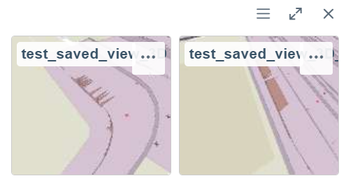
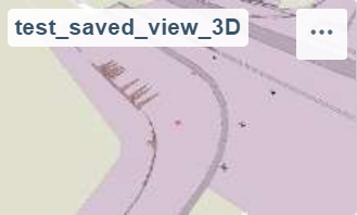
By clicking the folder name, the user can view all the saved views in the folder as thumbnails at the bottom of the tab.

By clicking the "List" icon, the user can view the image files as a list.
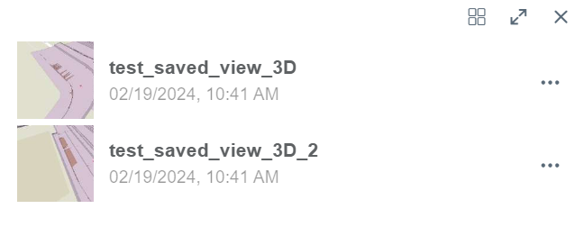
By clicking the "Thumbnails" icon, the user can view the image files as thumbnails.

By clicking the double arrow icon, a new side box will open next to the tab.

In this side box, the user can observe the content of the folder in a larger view.
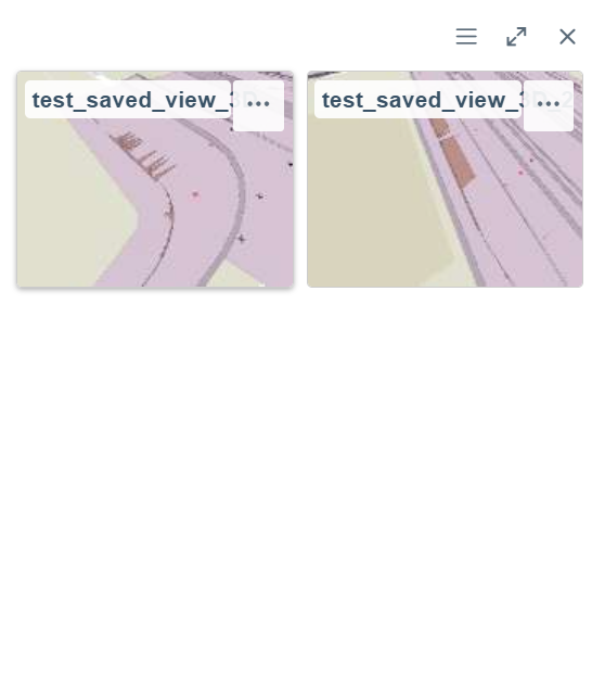
By clicking the x icon, the user can close the file view.

Sorting Tools

By clicking the three-dot icon in the top right corner of the tab, a box will appear.
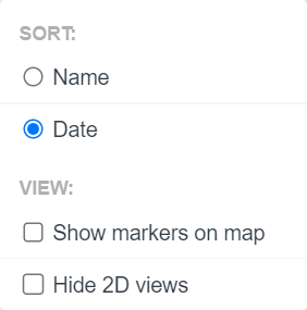
In the "SORT" section, the user can choose if the saved views are sorted alphabetically by the name or by the date the views were created.
By checking the box next to "Show markers on map", the user can determine if the saved view markers are visible on the map.
By checking the box next to "Hide 2D views", the user can determine if the 2D views taken on the "Map" page are visible or hidden in the folder tree.
Folder Tree Tools

Using this search bar, the user can search folders from the folder tree.

By clicking the "Expand tree" button, the whole folder tree will be revealed.

By clicking the "Collapse tree" button, the folder tree will be collapsed so that only the root folder will be visible.

By clicking the "Tree settings" button, a box will appear.
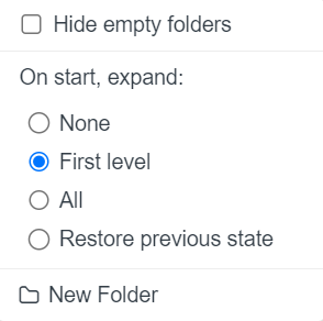
By adding a check mark to "Hide empty folders" all the empty folders in the folder tree will be hidden.
"On start, expand", the user can determine how the folder tree is shown after the browser page has been reloaded, for example, when the user logs in to Infrakit or refreshes the page. "None" means that only the root folder is shown; "First level" means that only the direct subfolders of the root folder will be shown; "All" means that all the folders in the folder tree will be shown; and "Restore previous state" means that the previous state of the folder tree will be restored.
By clicking "New Folder", the user can create a new folder under the folder that has been chosen.
Saved View Tools
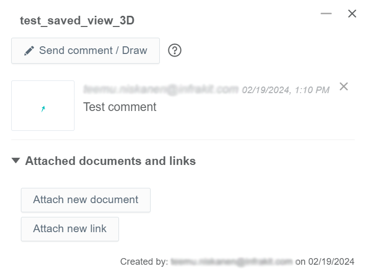
By clicking a saved view, the view will be generated on the map, and a box will open in the right corner of the screen.
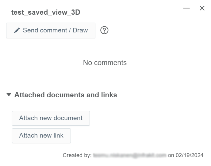
In this box, the user can add comments by utilizing drawing tools and attach files and links to the saved view.
By clicking the "Send comment / Draw" button, an additional box will appear.
In this box, the user can add a comment to the saved view.
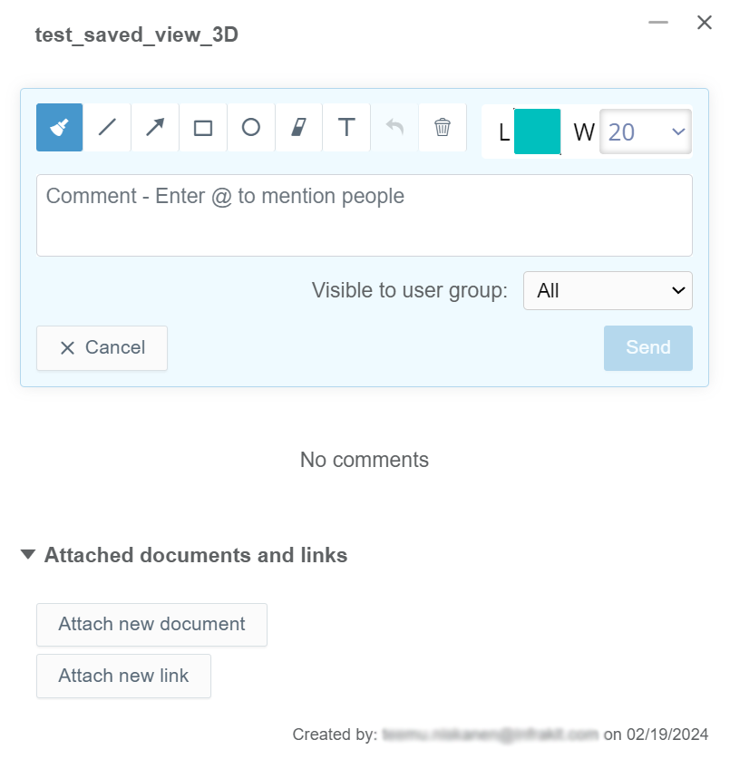
At the top of the box, the user can activate different tools to draw in the saved view.
In the "Comment" box, the user can add a written comment to the saved view.
From the "Visible to user group" drop-down bar, the user can determine which groups can view the comment. Groups can be created in the "Project Settings" page, section "Groups".
By clicking the "Send" button, the user can submit the comment.
By clicking the "Cancel" button, the user can return to the previous view without leaving a comment.
After the "Send" button has been clicked, the comment will appear in the previous box. All the comments will be listed in chronological order.
In the "Attached documents and links" section, the user can attach and observe documents and links.
By clicking the "Attach new document" button, a new view appears at the bottom.
In this view, the user can attach a document to the saved view.
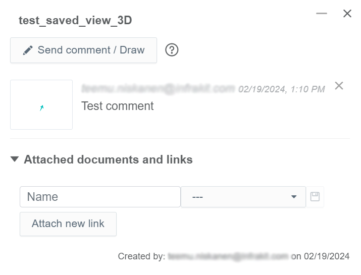
In the "Name" bar, the user can insert a name for the document.
From the drop-down bar, the user can select the document that will be attached to the saved view.
By clicking the save icon, the user can complete the attachment.

All the attached documents will be listed under the "Attached documents and links" section.
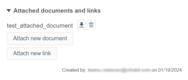
By clicking the downward arrow icon, the user can download the document file to local storage.


By clicking the trash can icon button, the user can detach the document file.
By clicking the "Attach new link" button, a new view appears at the bottom.
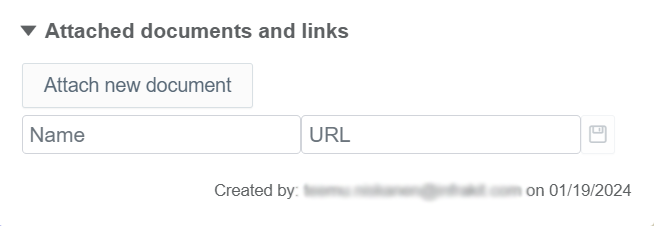
In this view, the user can attach a link to the saved view.
In the "Name" bar, the user can insert a name for the link.
In the "URL" bar, the user can insert the URL of the link.
By clicking the save icon, the user can complete the attachment.

All the attached links will be listed under the "Attached documents and links" section.
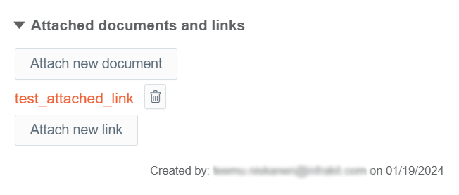

By clicking the trash can icon button, the user can detach the link.
By clicking the three-dot icon button, several different options appear.

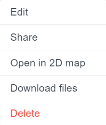
By clicking "Edit", a side window will open.
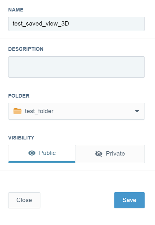
In this side window, the user can modify the basic attributes of the saved view.
In the "NAME" bar, the user can modify the name of the saved view.
In the "DESCRIPTION" bar, the user can provide a description for the saved view.
From the "FOLDER" drop-down bar, the user can change the folder where the saved view is located.
In the "VISIBILITY" section, the user can determine if the saved view is available for other users in the project. By clicking "Public", the saved view is available for other users in the project, and by clicking "Private", the saved view is only available for the creator.
By clicking the "Save" button, the user can save the modifications.
By clicking the "Close" button, the user can close the side window without saving the modifications.
By clicking "Share", a box will open.
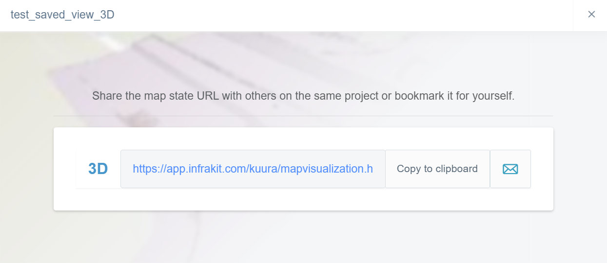
In this box, the user can share the URL of the saved view with other users of the project.
By clicking "Copy to clipboard", the user can copy the URL, which will direct the user to the saved view on the clipboard.

By clicking the envelope icon, a new box will open.
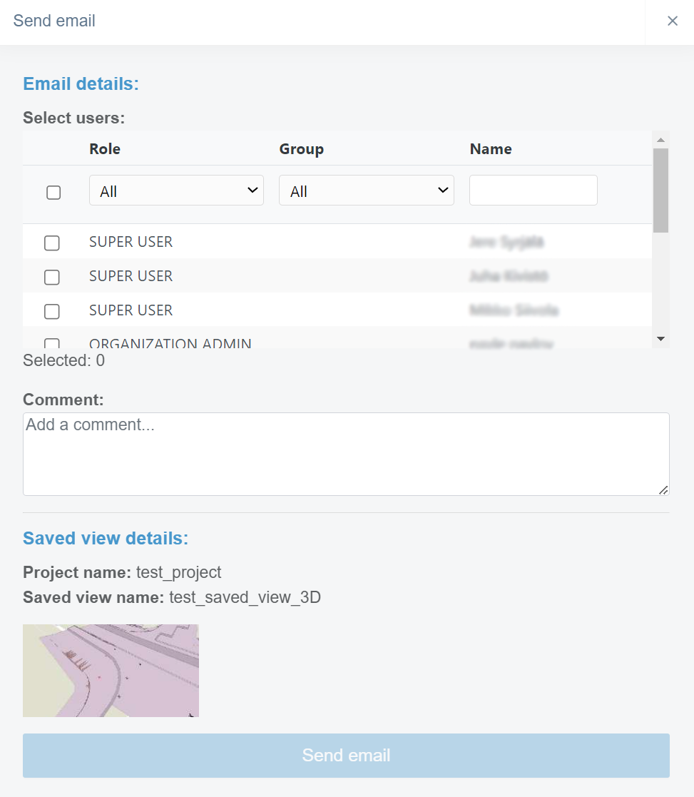
In this box, the user can send an email message to selected users that includes the URL to the saved view.
By checking the box in the user's row, the user can select to which users the URL of the saved view will be sent.
By using the "Role" and "Group" drop-down bars or the "Name" bar, the user can filter the users based on the role, group, or name. Groups can be created in the "Project Settings" page, section "Groups".
In the "Comment" section, the user can add an additional comment, which will be visible in the email message.
By clicking the "Send email" button, the user can send the email message.
By clicking "Open in 2D map", the user will be directed to the "Map" page, and the saved view will be active.
By clicking "Download files", the user can download all the files included in the saved view.
By clicking "Delete", the user can delete the saved view.
Create a Saved View
At first, the user has to choose the folder where the view will be saved. After this, by clicking the "Save view" button, the current map view will be saved to the chosen folder.

Mouse Actions
By clicking a saved view with the right button on the mouse, the same features and tools become available as when the three dots are clicked at the end of the file's row.
By clicking a folder in the folder tree with the right button on the mouse, one option appears.

By clicking "New Folder", a box will open.
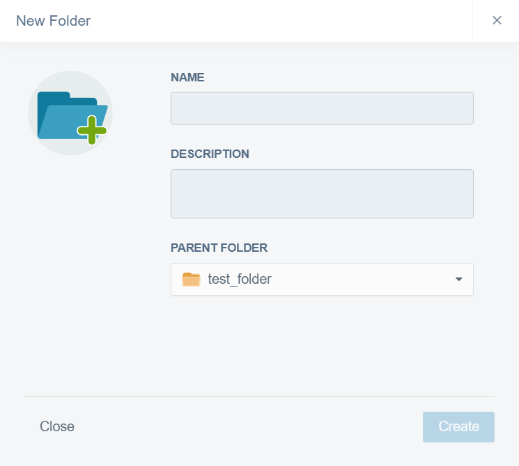
In this box, the user can create a new subfolder inside the selected folder.
In the "NAME" bar, the user must insert a name for the folder.
In the "DESCRIPTION" box, the user can provide additional information about the folder.
From the "PARENT FOLDER" drop-down bar, the user can change the parent folder for the new folder.
The user must click the "Create" button at the end to complete the creation. If the user wants to close the box without creating a folder, the "Close" button can be clicked.
Reality Capture
By clicking the "User settings" tab icon, the tab will open.

In the tab, the user can adjust the visualization of the point clouds.
The point cloud file can be uploaded on the "Files" page in a desired folder as a LAZ or LAS format.
Activating Point Cloud File
A point cloud file can be activated from the "Models" tab by checking the box next to the file name.
By clicking the file name with the left button on the mouse, the screen can be adjusted according to the file's content.
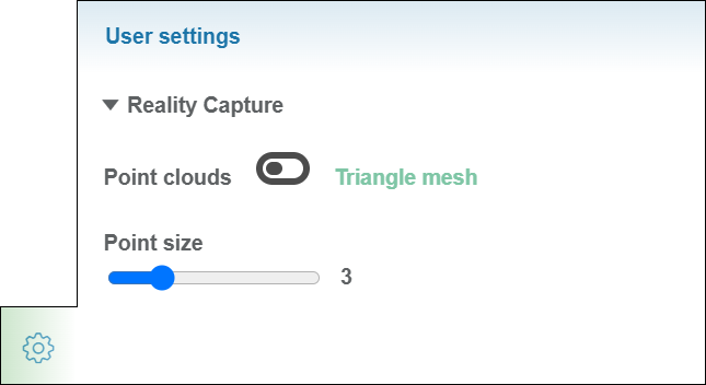
Point Cloud Adjusting Tools
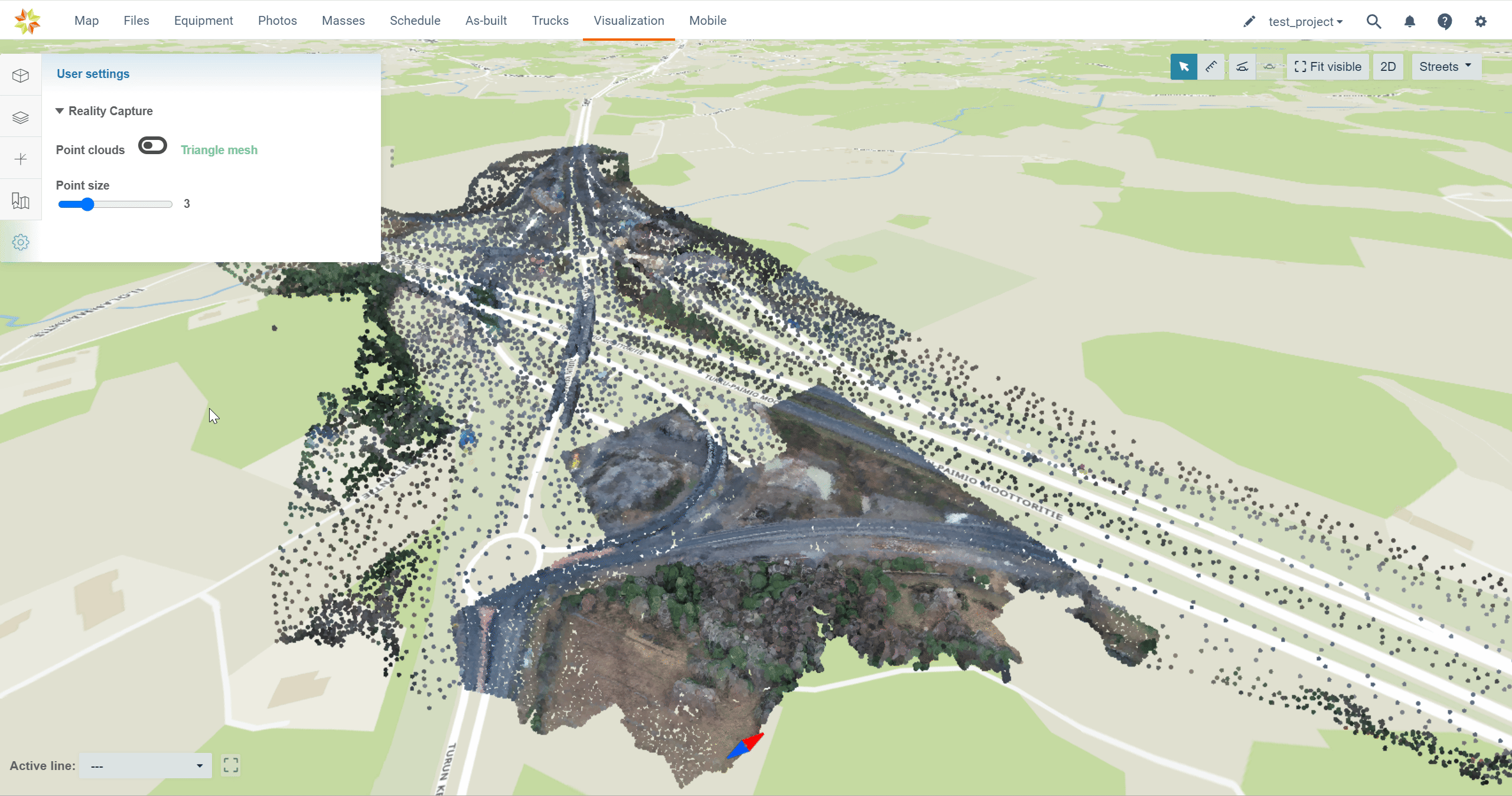
By switching the knob between "Point clouds" and "Triangle mesh", the user can determine if the point cloud is visualized as points or triangle mesh.
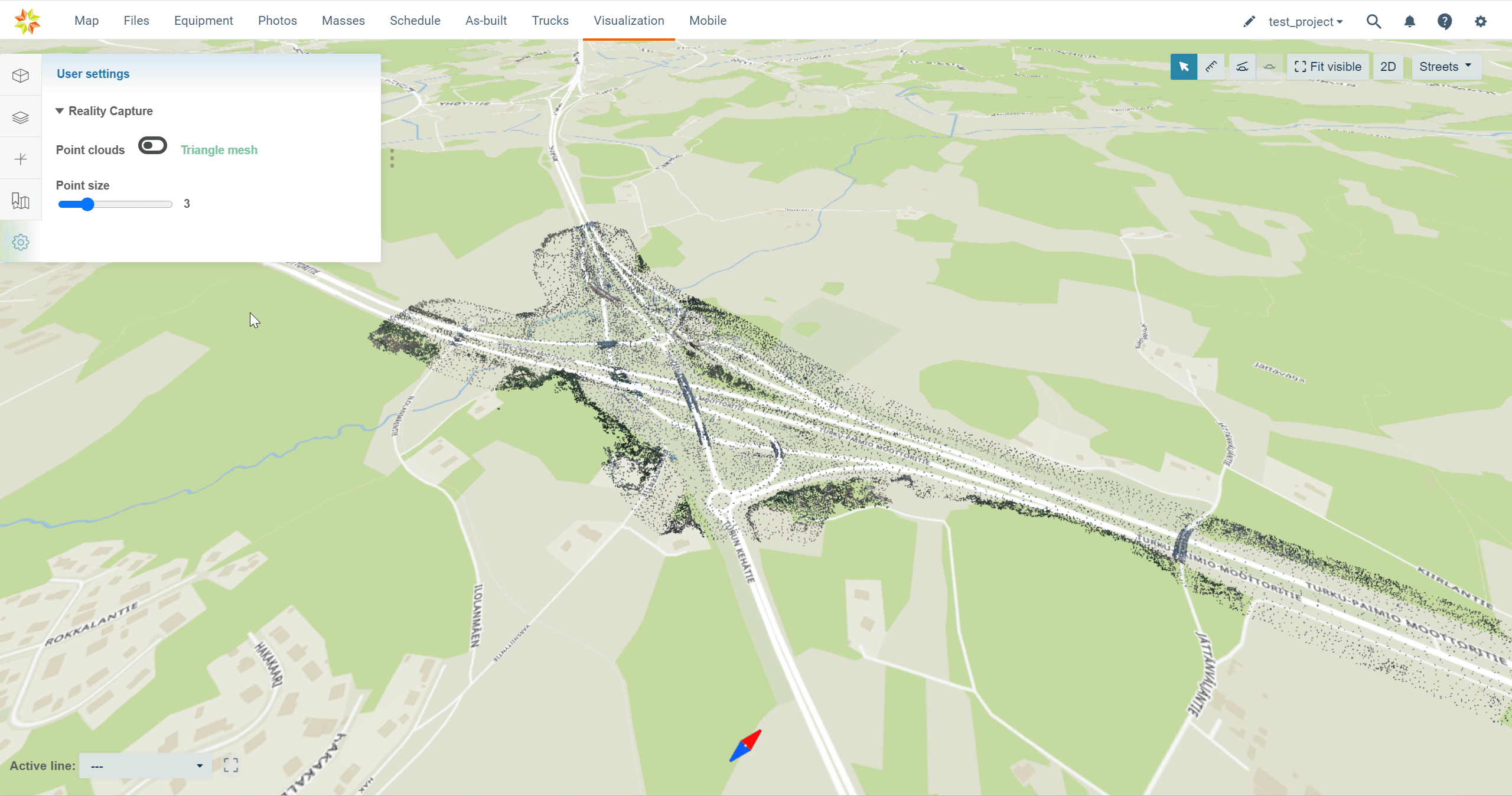
When the knob is on the "Point clouds" side, the user can alter the point's size by sliding the knob in the section "Point size".
3. Active Alignment
Active alignment can be selected from the left corner of the page.
From the drop-down box, folders can be browsed and alignment activated.

By clicking the square dashed line icon, the user can fit the active alignment to the screen.

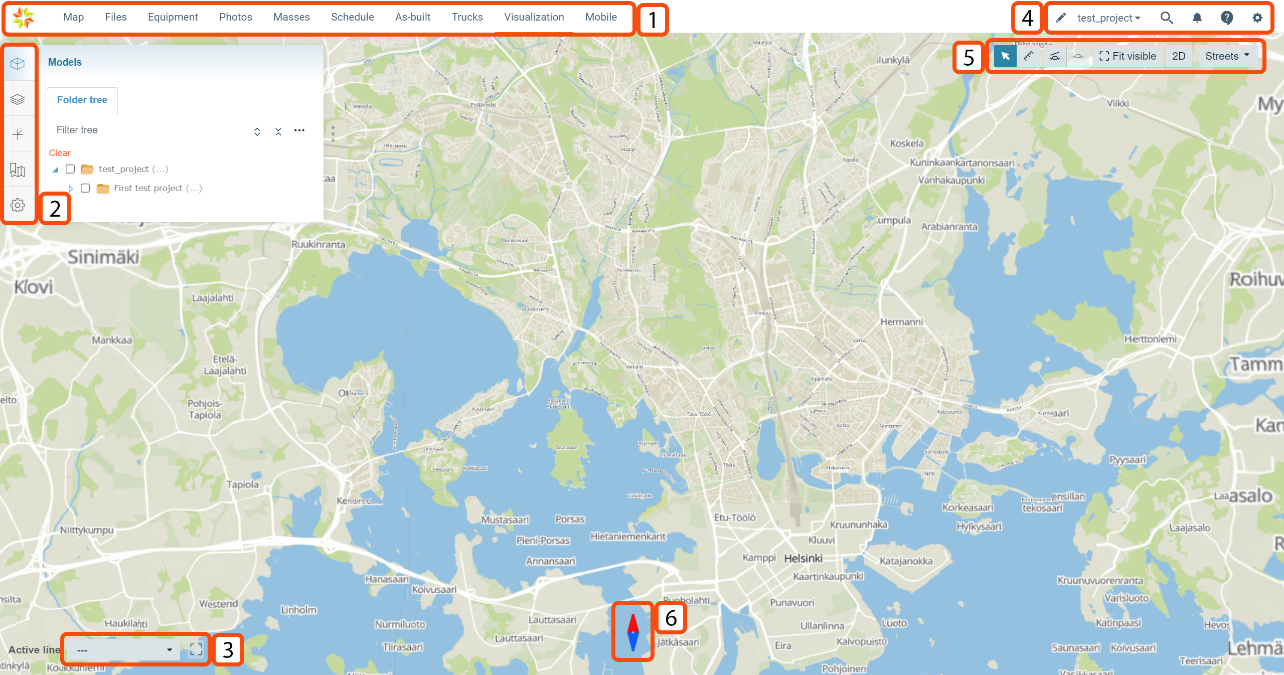
4. General Features
At the right corner of the top ribbon, four general features can be found.
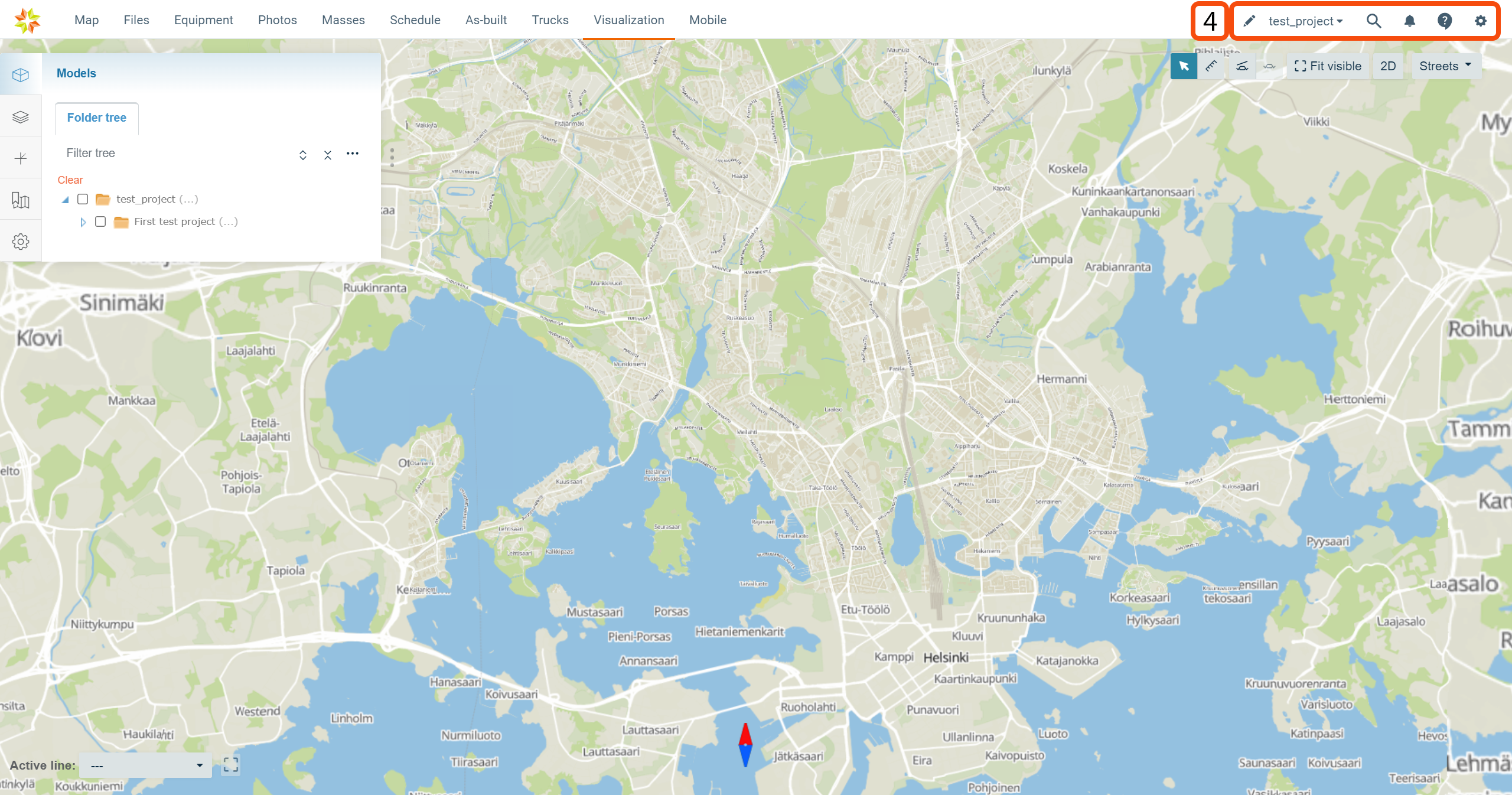

By clicking the pen icon, the user will be directed to the "Project Editing" page.

From the drop-down box, the user can select the active project.

By clicking the magnifying glass icon, a new box appears.

In this box, the user can search for content from the "Visualization" page by using the search bar at the top. By selecting the module "All", "Models", "Drawings", or "Saved views", the user can specify the search to only include selected items.

By clicking the bell icon, a new box appears.
This box contains six tabs: "All", "Files", "Folders", "Photos", "Services", and "Chat".
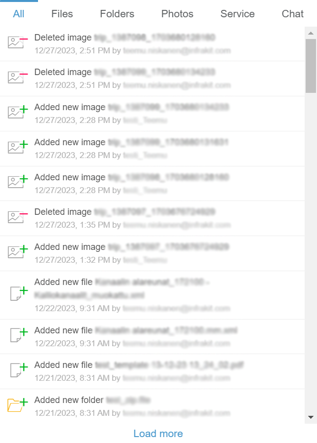
"All" is the default tab when the box opens. In this tab, all the notifications on the project are listed.
The "Files" tab contains all notifications concerning files.
The "Folders" tab contains all notifications concerning folders.
The "Photos" tab contains all notifications concerning image files.
The "Service" tab contains general notifications concerning Infrakit software.
Through the "Chat" tab, users can send messages inside a project.
By clicking "Load more," the user can observe older notifications.

By clicking the speech bubble icon, a new box appears.

Through the "Search for articles" bar, the user can browse Infrakit's knowledge base using key words that, for example, represent functions, tools, or operations.
By clicking the "Create support ticket" button, a new view will appear.
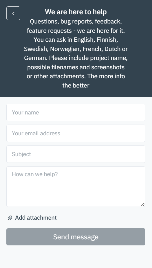
In this view, the user can send a message to Infrakit's customer support team.
In the "Your name" bar, the user can insert his or her own name.
In the "Your email address" bar, the user can insert his or her own email address.
In the "Subject" bar, the user should write a succinct description of the issue.
In the "How can we help?" box, the user should describe the issue as detailed as possible. The more related information is provided, the easier it is for the support team to investigate the issue.
By clicking "Add attachment", the user can add attachments to the message. Attaching images, videos, and files where the issue occurs will help to solve the issue more efficiently.
By clicking the "Send message" button, the message will be sent to the support team.
By clicking the arrow icon button, the user can change to the previous view.

By clicking the x icon button, the user can close the customer support box.


By clicking the gear icon, a new box will open.
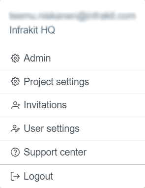
This box contains six options: "Admin", "Project settings", "Invitations", "User settings", "Support Center", and "Logout".
By clicking "Admin", the user will be directed to the starting page of the "Admin" features.
By clicking "Project settings", the user will be directed to the "Project Settings" page.
By clicking "Invitations", the user will be directed to a new page where invitations can be viewed and accepted or rejected.
By clicking "User settings", the user will be directed to the "User Settings" page.
By clicking "Support center", the user will be directed to the "Support Center" web page, where guidelines for how to use Infrakit software can be searched and contact information can be found.
By clicking "Logout", the user will be logged out of the Infrakit software.
5. General Tools
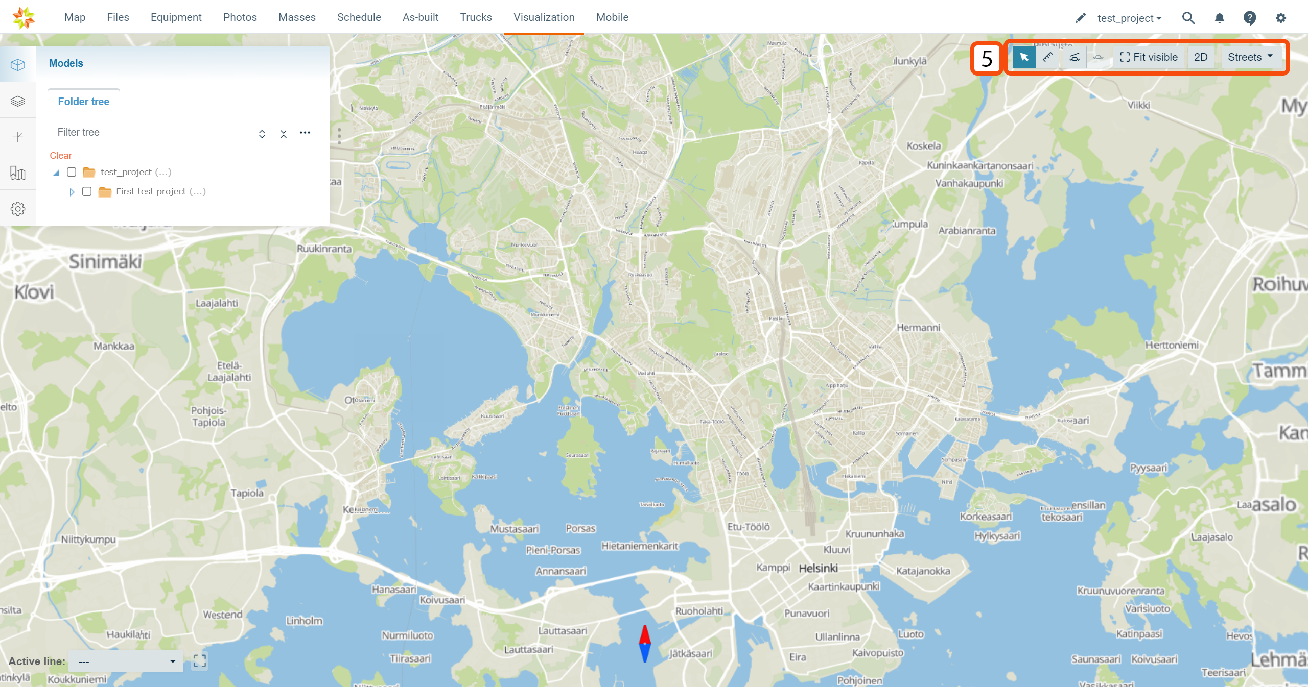


In the top right corner, under the top ribbon, a set of tools can be found.
Model Selection Tool
By clicking the arrow icon, the user can select objects on the map.

Measuring Tool

By clicking "Measuring tool" button, the distance measuring tool will be activated, and the user can measure the distance between two arbitrary points.
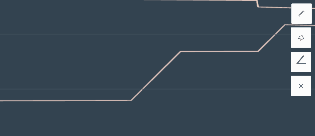
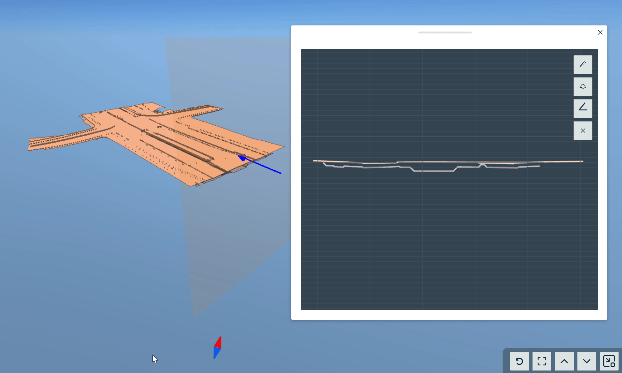
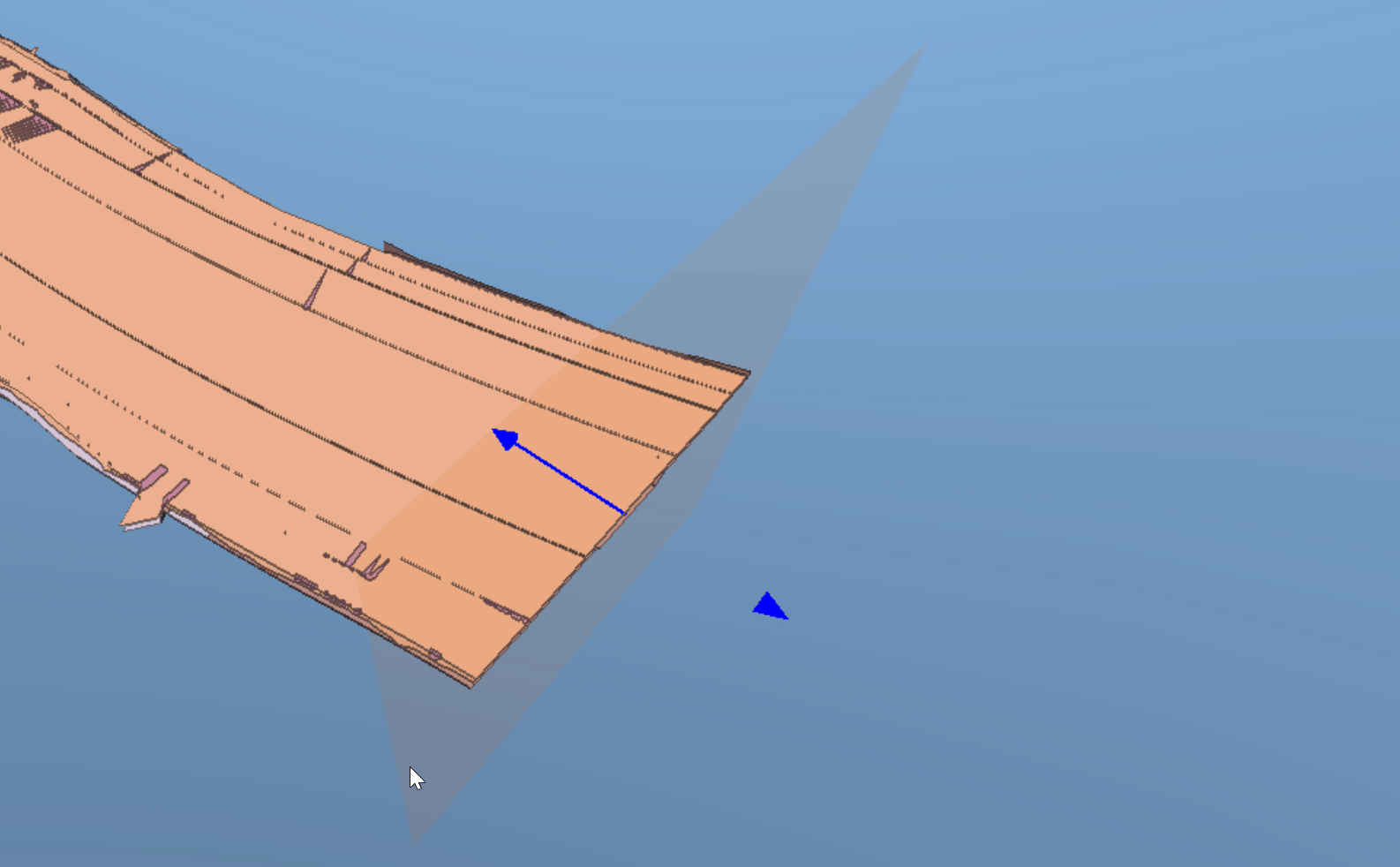
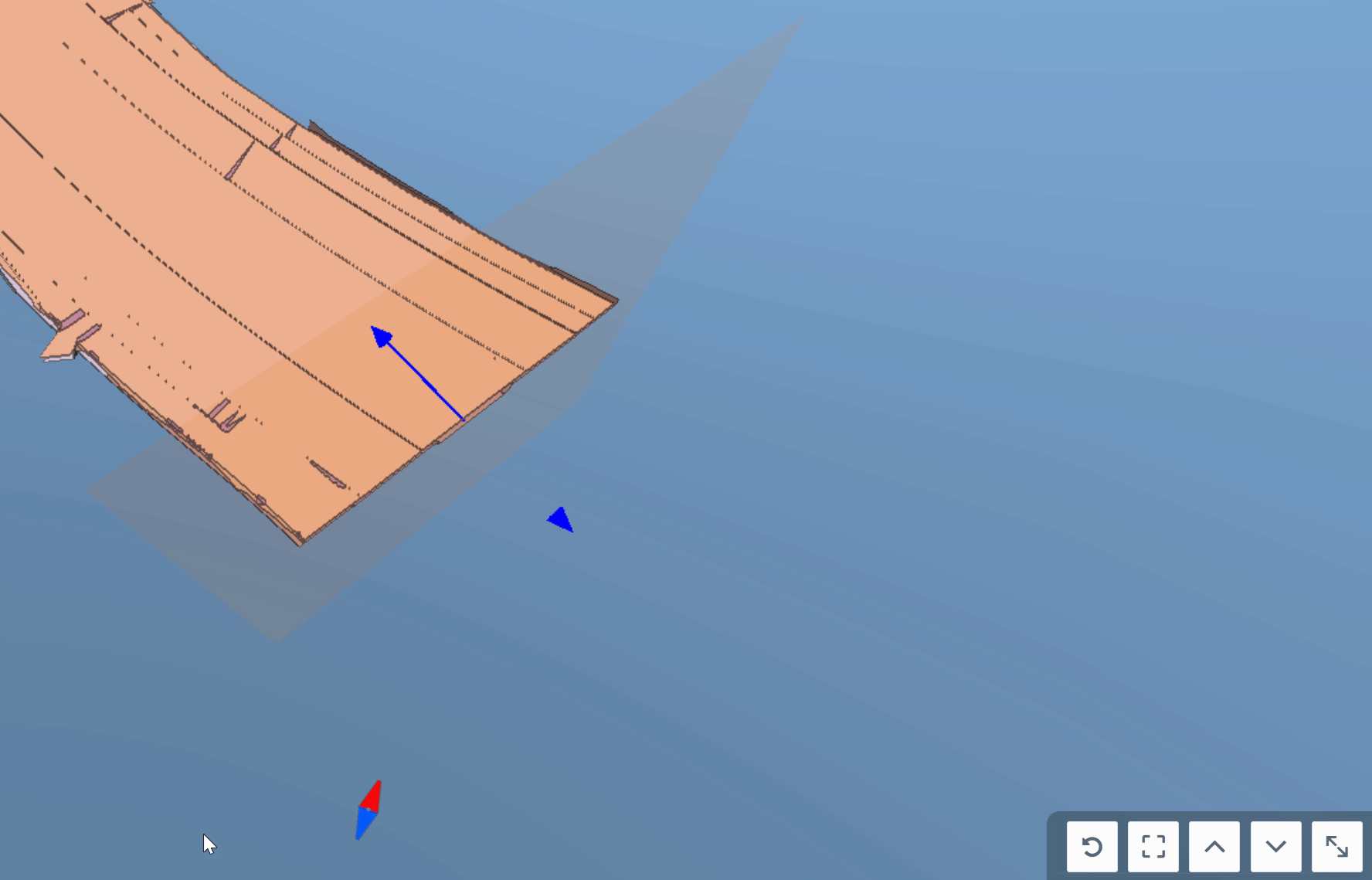
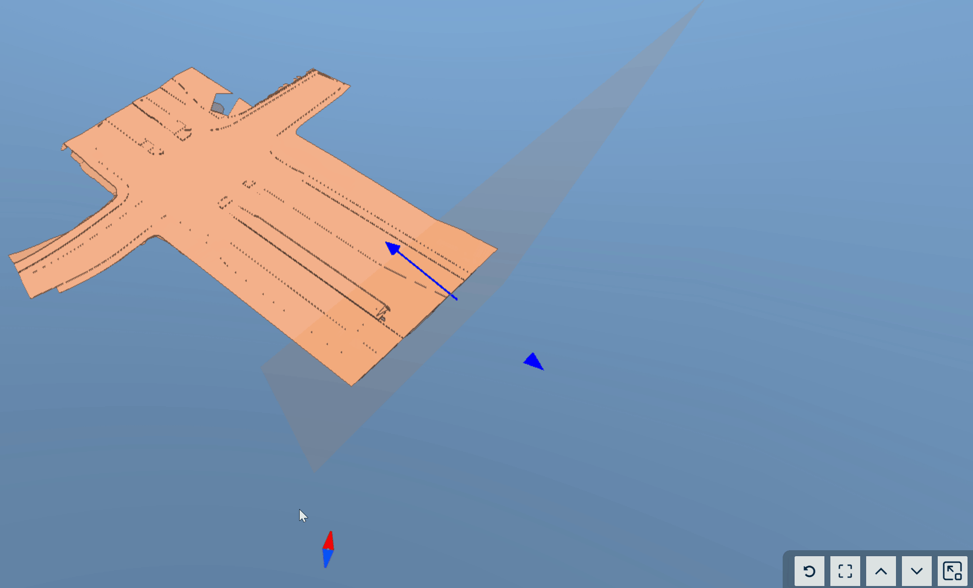
Cross-Section Tools
The user can draw a cross-section by selecting an alignment or clicking two arbitrary points on the map.
Free Cross-Section
By clicking the "Draw free cross section" button, the free cross-section tool will be activated, and the user can draw a cross-section by clicking two arbitrary points on the screen.


When the cross-section has been created, cross-section view tools become available.

By clicking the arrow icon, the user can open and close the cross-section view window.
When the cross-section view window is opened, additional tools become available.


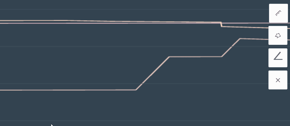
By clicking the "Enable distance measuring" tool button, the user can measure the distance between two arbitrary points.

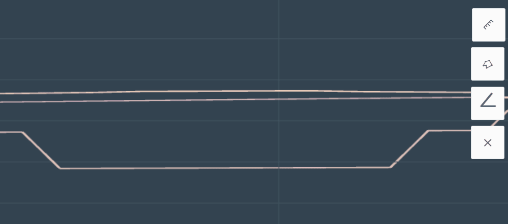

By clicking the "Enable area measuring tool" button, the user can measure areas from the cross-section view. By clicking three or more points, the area will be drawn and calculated. These points can be selected from the model or arbitrarily from the cross-section view. The area can be closed by double-clicking the left mouse button.

By clicking the angle measurement tool, the user can measure the angle between two arbitrary points.
By clicking the x icon, the user can remove the measurements from the cross-section view.


By clicking the arrow icon buttons, the user can move the cross-section along the x axis.
By clicking the x-axis with the left button on the mouse and holding it down, the user can also move the cross-section along the axis.

By clicking the "Fit into view" button, the user can perpendicularly zoom into the cross-section.

By clicking the round arrow icon, the user can change the direction of the cross-section.
Alignment-Based Cross-Section
When an alignment is activated, the alignment-based cross-section tool becomes available.
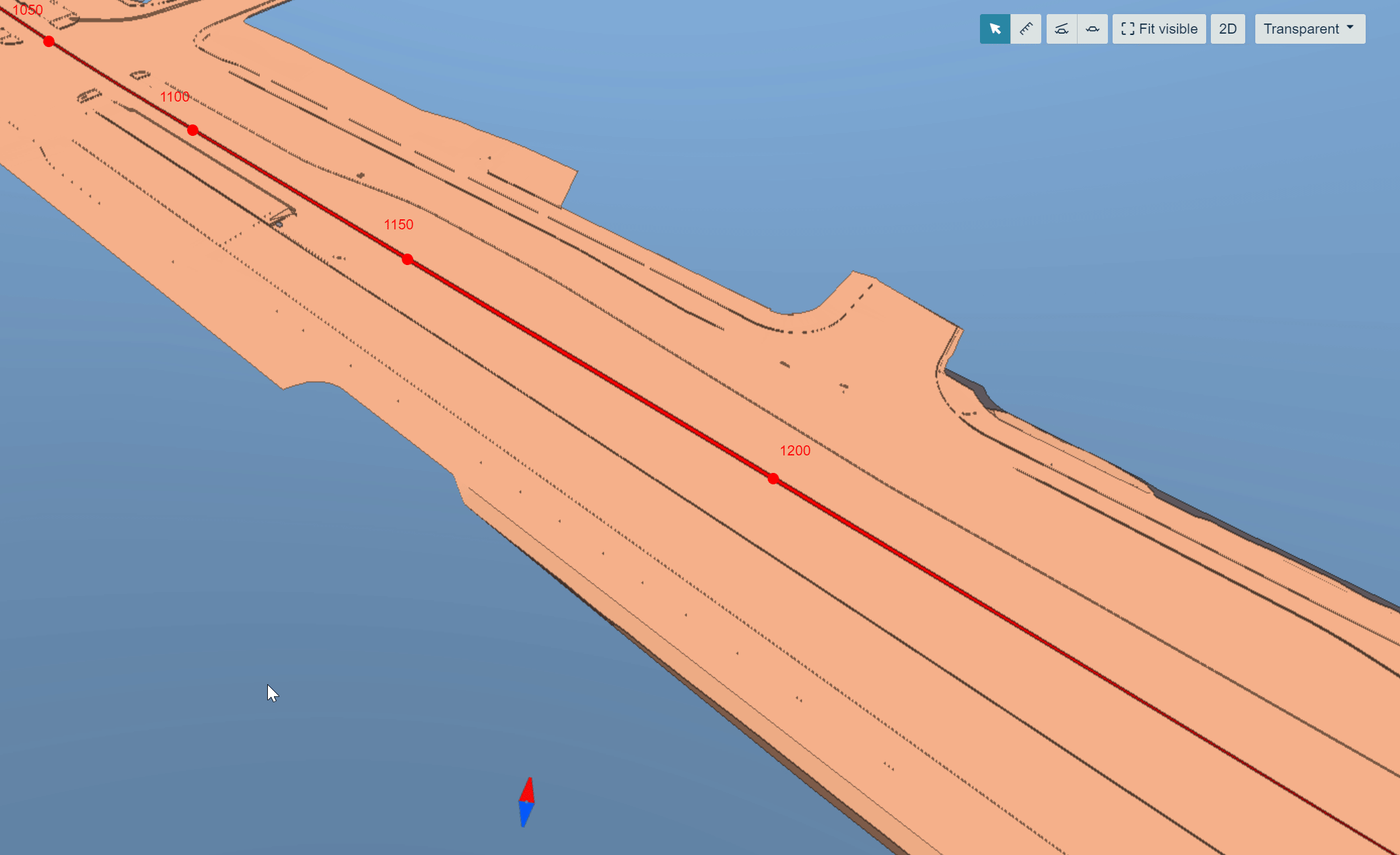
By clicking the Cross section" button, the cross-section tool will be activated, and the user can draw a cross-section by clicking a point along the active alignment.

When the cross-section has been created, cross-section view tools become available.
These tools are the same as in the "Free Cross-Section" except the cross section is drawn along the selected alignment and not along the x axis.
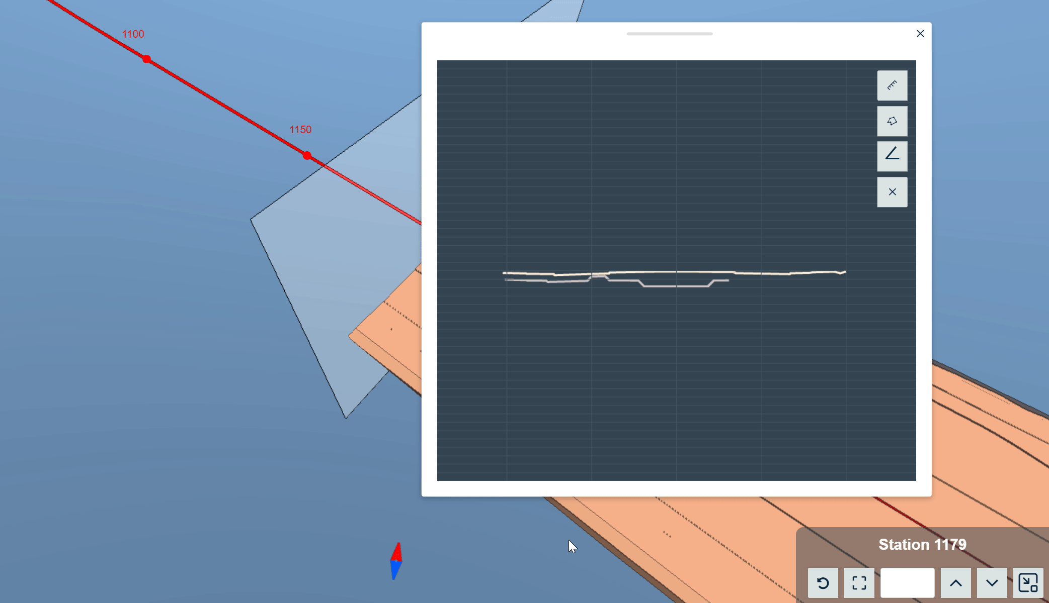
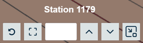
For an additional tool, the user can insert a station number in the bar, and by pressing enter, the cross-section will be moved to the selected station.
Fit Visible Tool
By clicking "Fit visible", the active objects will be fitted to the screen.

2D View Tool
By clicking the "2D" button, the user will be directed to the "Map" page, and all the active models and lines will stay active.

Map Tile Layer Selection Tool
From the map tile layer drop-down bar, the user can change the map tile layer or make the map transparent.

6. Map Tools
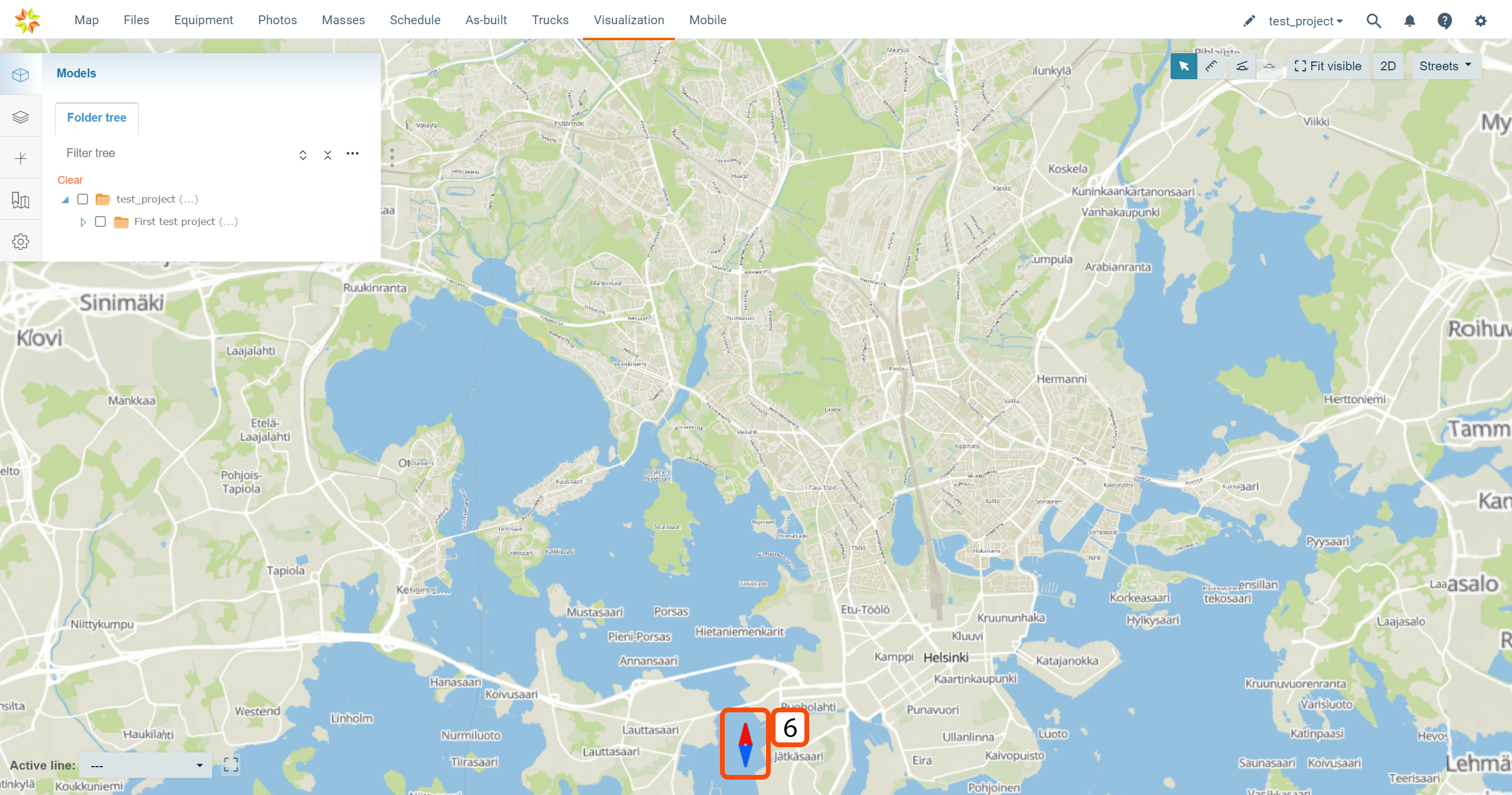
By clicking the compass, the user can reset the orientation of the screen to the default north-south orientation.
2. Keyboard Actions
By pressing Ctrl + space, the user can open the search box.
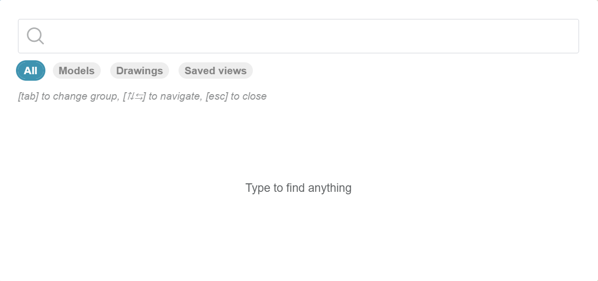
In this box, the user can search for content from the "Visualization" page by using the search bar at the top. By selecting the module "All", "Models", "Drawings", or "Saved views", the user can specify the search to only include selected items.
3. Recommended System Adjustments
Windows
The user can enhance the performance of the browser by adjusting Windows's "Graphics" settings.
Path to graphics settings: Settings -> System -> Display -> Graphics
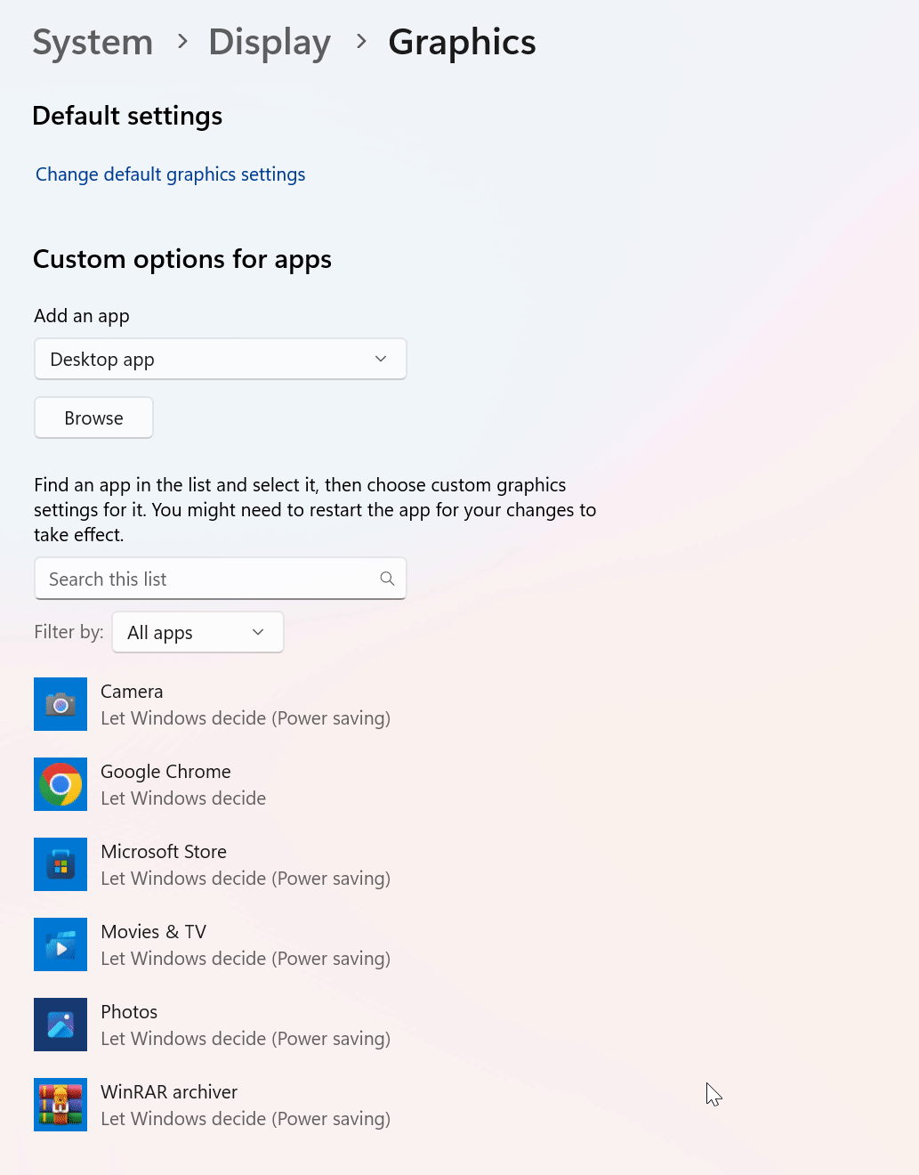
In this window, the user can force Windows to use a specific GPU with a preferred browser.
By selecting a preferred browser and clicking "Options", a list of available GPUs appears. By selecting a GPU and clicking "Save", the selected GPU will be used with the browser.